Why Your Branding Isn’t Working (And It’s Not Your Logo)
Most people think their branding problem is their logo.
So they redesign it.
Tweak it.
Change the colours.
Maybe even run to Canva or some AI tool hoping it’ll magically fix everything.
It doesn’t.
Because the problem was never the logo to begin with.
It’s consistency.
And it’s the one thing quietly killing more brands than bad design ever will.
The Real Problem
When I look at most small business brands, I don’t see a lack of effort.
I see this:
• A clean, modern website
• A chaotic Instagram feed
• A minimalist logo
• A loud, messy brand voice
Individually? Some of it looks good.
Together?
It feels like four different brands fighting each other.
And that’s where things start to break.
Why Consistency Actually Matters
Branding isn’t just about looking good.
It’s about being recognisable.
Your audience should be able to:
• recognise your content instantly
• understand your tone without thinking
• feel the same energy across every touchpoint
Even if your logo isn’t there.
Because in reality?
Your logo is one of the least seen parts of your brand.
Your content, your tone, your visuals, that’s what people experience daily.
Where Most Businesses Go Wrong
Here’s the pattern I see over and over:
They design for themselves.
Not their audience.
They pick:
• colours they like
• fonts they like
• styles they like
Instead of asking:
“What actually resonates with the people I’m trying to attract?”
And that’s where branding quietly stops working.
The Strategy Most People Skip
Before I design anything, I go deep into:
• the business
• the competitors
• the audience
• what makes that brand different
Because without that?
Design is just decoration.
With it?
Design becomes direction.
Real World Example
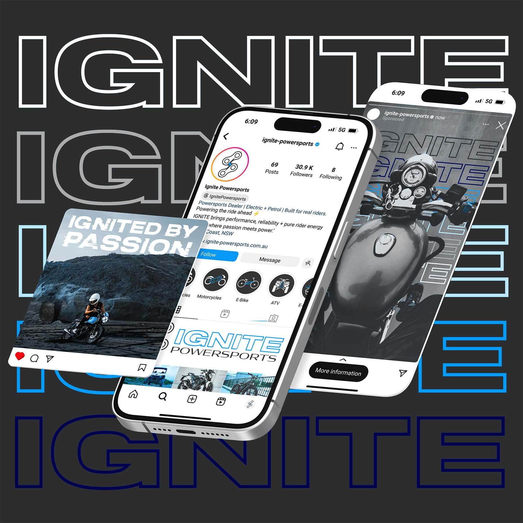
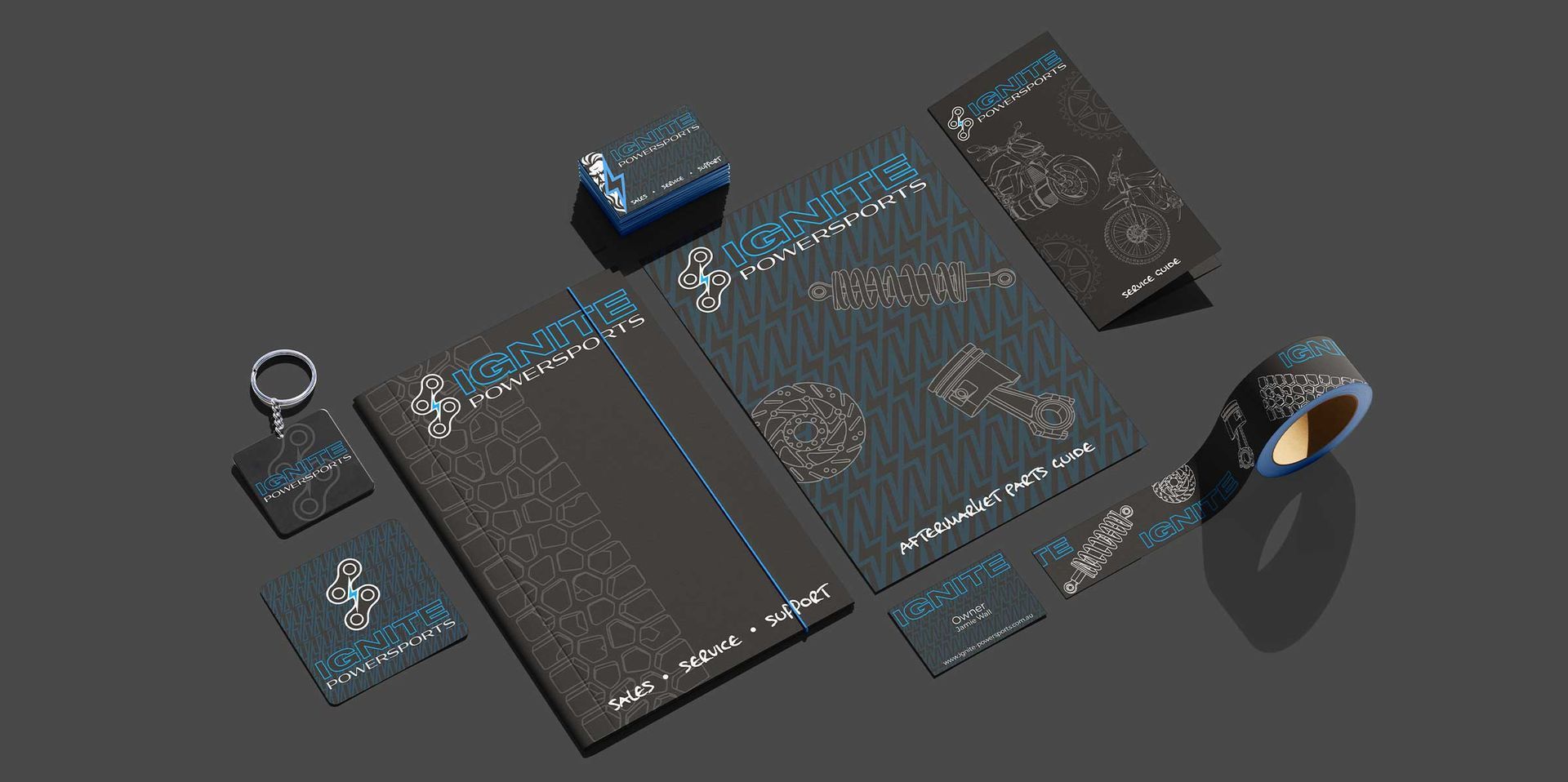
The first time I saw this fully click was working on IGNITE.
They came in with a generic AI-generated logo.
The real issue wasn’t how bad it looked.
It was that the brand had no clear identity.
Once we stepped back and looked at the business as a whole:
• petrol + electric
• multiple services under one brand
• a need for both power and approachability
Everything changed.
The logo wasn’t the starting point anymore.
It was the result of the strategy.
And for the first time, everything aligned.
Jamie signed off the entire brand with zero changes.
Not because it “looked cool”
But because it
made sense.
The Takeaway
If your branding isn’t working, ask yourself this:
• Does everything feel like it belongs together?
• Does it speak to your audience, not just you?
• Is it consistent across every touchpoint?
Because if the answer is no…
Changing your logo won’t fix it.
That’s the difference between having a logo…
and having a brand that actually works.
THE DISARMING DOWNLOAD