Behind the Brand - BASED ORIGINS
A brand built to break the rules.
Disarming Designs for Based Origins - Based Origins isn’t just another supplement brand — and that was the entire point. Built on nose-to-tail philosophy and bold AF attitude, they wanted to stand apart from the sea of clinical, lookalike supplement packaging. Their core message? Whole-animal nutrients, real ingredients, and zero f*cks given.
This brand identity was created to pack a punch: visually, verbally, and strategically. Let’s dive into how we brought it to life.
The Brief
Based Origins needed branding that reflected their mission: nutrient-dense supplements made from grass-fed liver, heart, collagen, colostrum, and cacao. Their “Base Shake” was positioned as the world’s most nutrient-packed powder blend — no fillers, no fluff.
They wanted something bold, modern, and impossible to ignore. Not sterile, not stock-standard — something worthy of building a community around.
Core Goals:
- Stand out from other supplement brands
- Appeal to bold, health-conscious customers
- Balance clean, confident visuals with scientific credibility
- Reflect their unapologetic, "be you" ethos
Project Snapshot
Client: Based Origins
Industry: Supplements for the Fitness Industry
Services Delivered:
Brand strategy, brand identity design, logo suite, social media assets, packaging mockups, brand guidelines, brand collateral.
Target Audience: All genders | Ages 20–40
Health-conscious, curious, self-improvers with a “mind/body/spirit” lifestyle. Often entrepreneurial, wellness-focused, and down to spend money on quality. This is a crowd that’s done the research — they want results without fluff.
The Challenge
The fitness supplement space is cluttered. Think: endless white tubs, all-caps typography, generic labels. Based Origins wanted none of it.
But how do you:
- Make something visually loud and still feel premium?
- Communicate high-quality ingredients while keeping it fun?
- Appeal to a wide range of customers without losing edge?
That was my job to figure out.
research + Brand strategy
I focused on:
- The nose-to-tail philosophy — using the whole animal as nature intended.
- Red vs. purple hues to create gender-distinct sublines while keeping the brand cohesive.
- Bull symbolism to channel power, energy, and primal strength.
- Fonts and layouts that balance science-backed messaging with badass personality.
Creative Direction
Visual Concept:
"Unleash the Bull Within"
The brand leans into the primal energy of its ingredients, using a modern bull as the key visual. Everything flows from that — typography, taglines, packaging, and merch.
Typography:
- Bold, punchy sans-serif fonts
- Clean and legible, but packed with power
Colours:
- Red-based tones for masculine-coded products
- Purple hues for feminine-coded products
- Monochrome accents for balance and versatility
Design Solutions
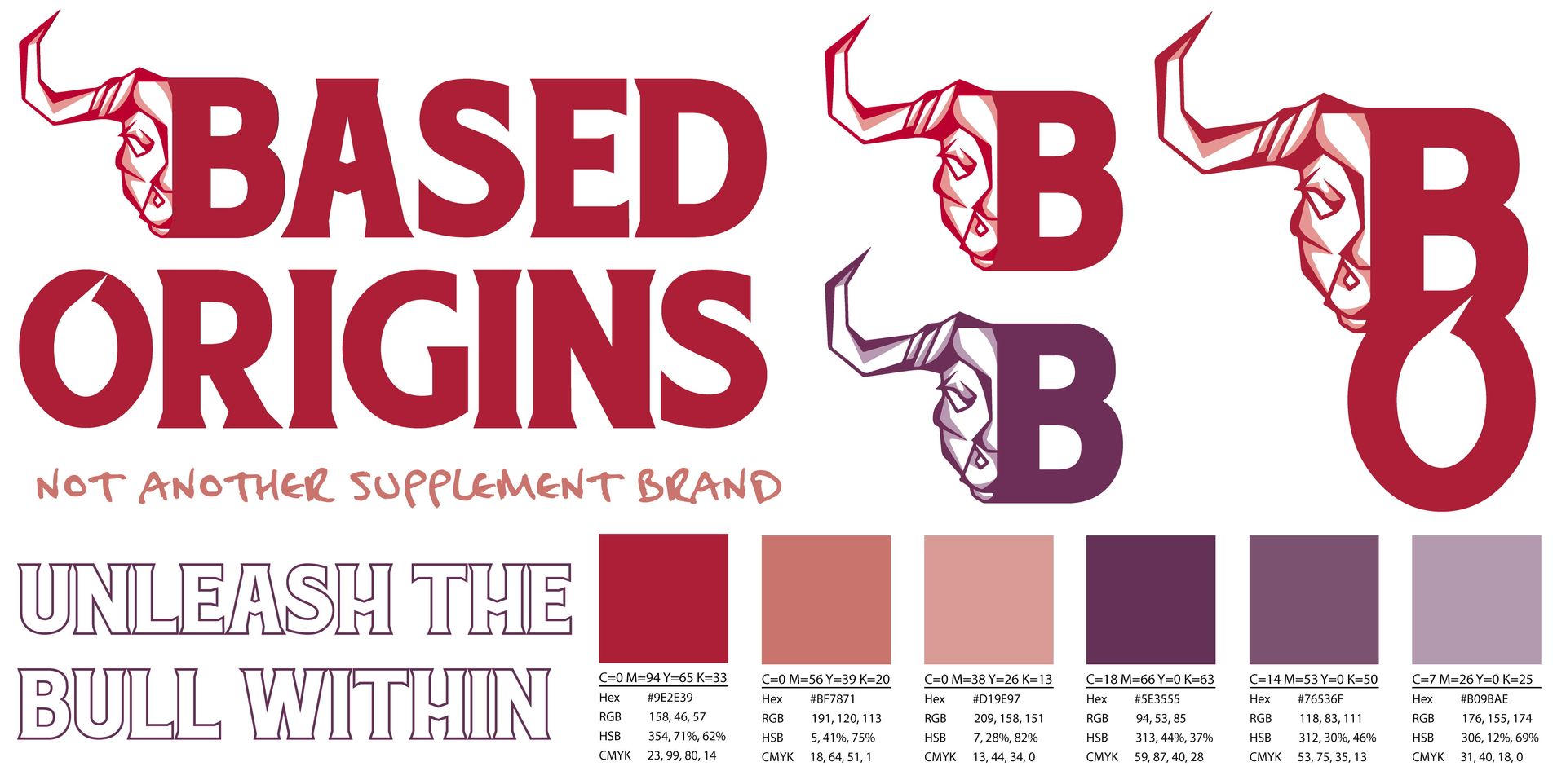
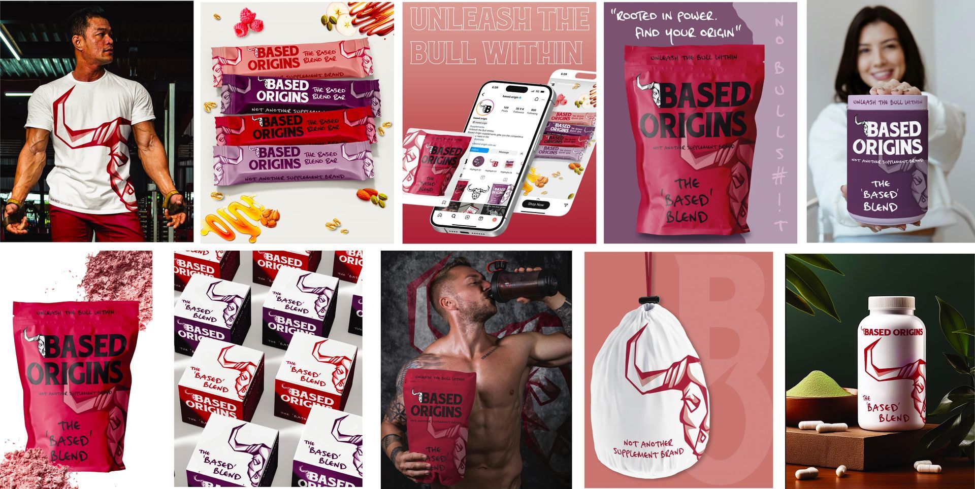
Logo suite
The bull icon is designed to feel modern and fierce, avoiding typical fitness clichés. It pairs with stacked type lockups and a brandmark “B-O” monogram for smaller uses.
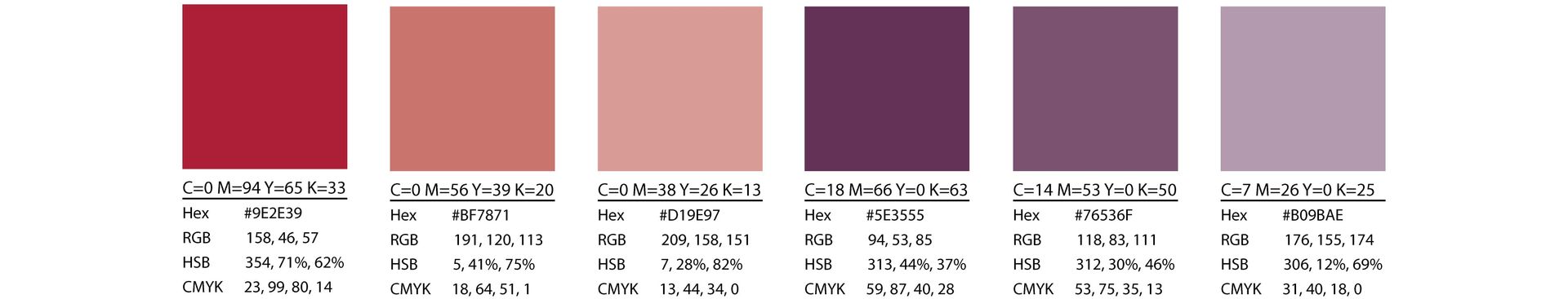
Colour Palette
The colour palette was designed to be unapologetically bold just like the brand’s voice. Strong reds anchor the men’s range, while rich purples power the women’s, each extended with tonal variations to create a cohesive yet flexible system. These colours scream premium, stand-out-on-the-shelf energy without falling into the trap of overdone neon or sterile medical tones.
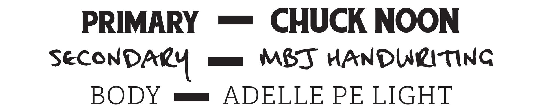
Typography
For typography, I went with bold, modern sans-serifs that command attention and deliver the brand’s message with clarity and power. The stacked weight and no-nonsense forms of the fonts mirror the strength and simplicity of the ingredients inside. This type setup helps the brand feel fresh, direct, and confidently ‘based’.ins
Mockups & Brand Assets
To show the brand in context, I designed:
- Protein powder pouch
- Supplement tablet packaging
- Branded clothing and hats
- Apple Watch interface mockups
- Instagram post concepts
- Taglines like “Unleash the Bull Within” and “Not Another Supplement Brand”
design deliverables
- Logo suite
- Colour palette
- Typography system
- Branded illustrations (Bull icon + monogram)
- Product packaging mockups
- Merch + social media concepts
What I Loved About This Project
I loved building out a bold, layered colour system and working through the challenge of making something that looks great and educates customers.
The real flex? Marrying visuals that scream "look at me" with a product that actually delivers.
Key Takeaways
- Don’t be afraid of bold visuals as long as they align with your client's target market and message.
- If your product’s different, your branding has to show it.
- Building a community vibe means building a brand world, not just a label.
Want to get your Brand looking Right?
THE DISARMING DOWNLOAD