IGNITE Powersports
A Future-Proof Visual Identity Designed to Scale
IGNITE Powersports is a pre-launch Australian powersports brand built around a bold idea: the future of riding shouldn’t force you to choose between petrol heritage and electric innovation.
Brought on as the brand and visual identity designer, I was tasked with creating IGNITE’s entire brand system from the ground up - not just a logo but a complete visual identity designed to grow from startup launch to large-scale expansion.
From strategy through to execution, for this project I focused on building a brand that feels premium, modern + inclusive, while remaining flexible enough to support motorcycles, ATVs, UTVs, electric bikes, scooters, and future product categories.
This case study explores the thinking, strategy + design decisions behind creating a scalable brand identity built for long-term success.
THE CHALLENGE
IGNITE Powersports is in a pre-launch phase, with no existing branding in place. Everything needed to be built from scratch.
The challenge wasn’t just visual, it was strategic.
IGNITE needed a brand that:
- Bridged petrol heritage and electric innovation
- Felt community-first, not intimidating or old-school
- Avoided tired motorcycle clichés (skulls, flames, hyper-masculinity)
- Worked across multiple vehicle categories — motorcycles, ATVs, UTVs, electric bikes, scooters, and future products
- Could scale seamlessly from a small startup to a large, recognisable brand
Most importantly, the identity needed to feel modern, premium and original, without alienating new or female customers.
MY ROLE
I was brought on to design IGNITE’s entire visual identity system end to end.
This included:
- Brand strategy and positioning
- Initial logo concept exploration and presentation
- A complete logo system (primary, secondary, brandmark + signature graphic)
- Typography and font pairing selection
- Full colour palette development
- Custom brand patterns and background assets
- Custom vehicle illustrations
- A full suite of 20+ website and social icons
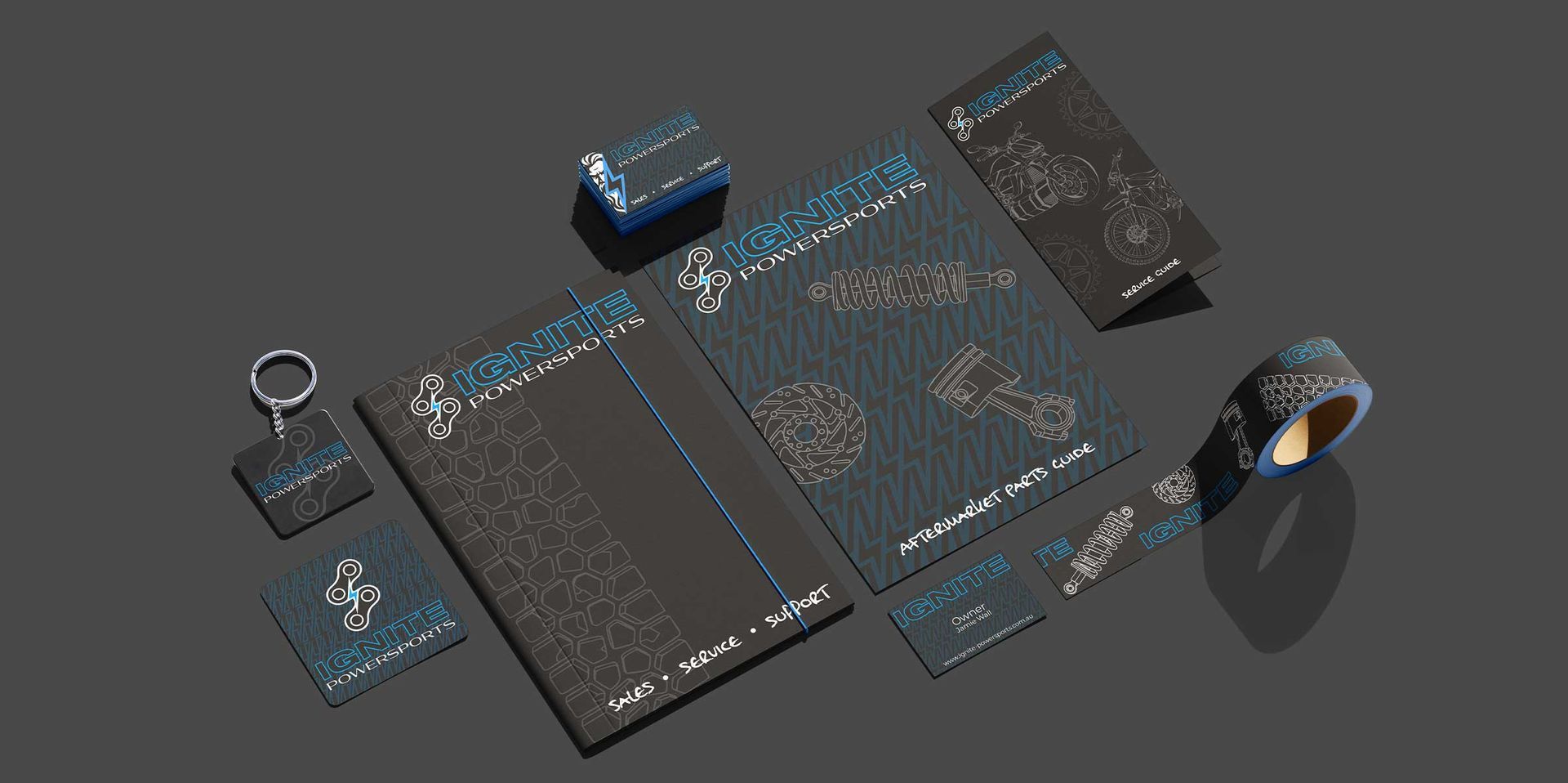
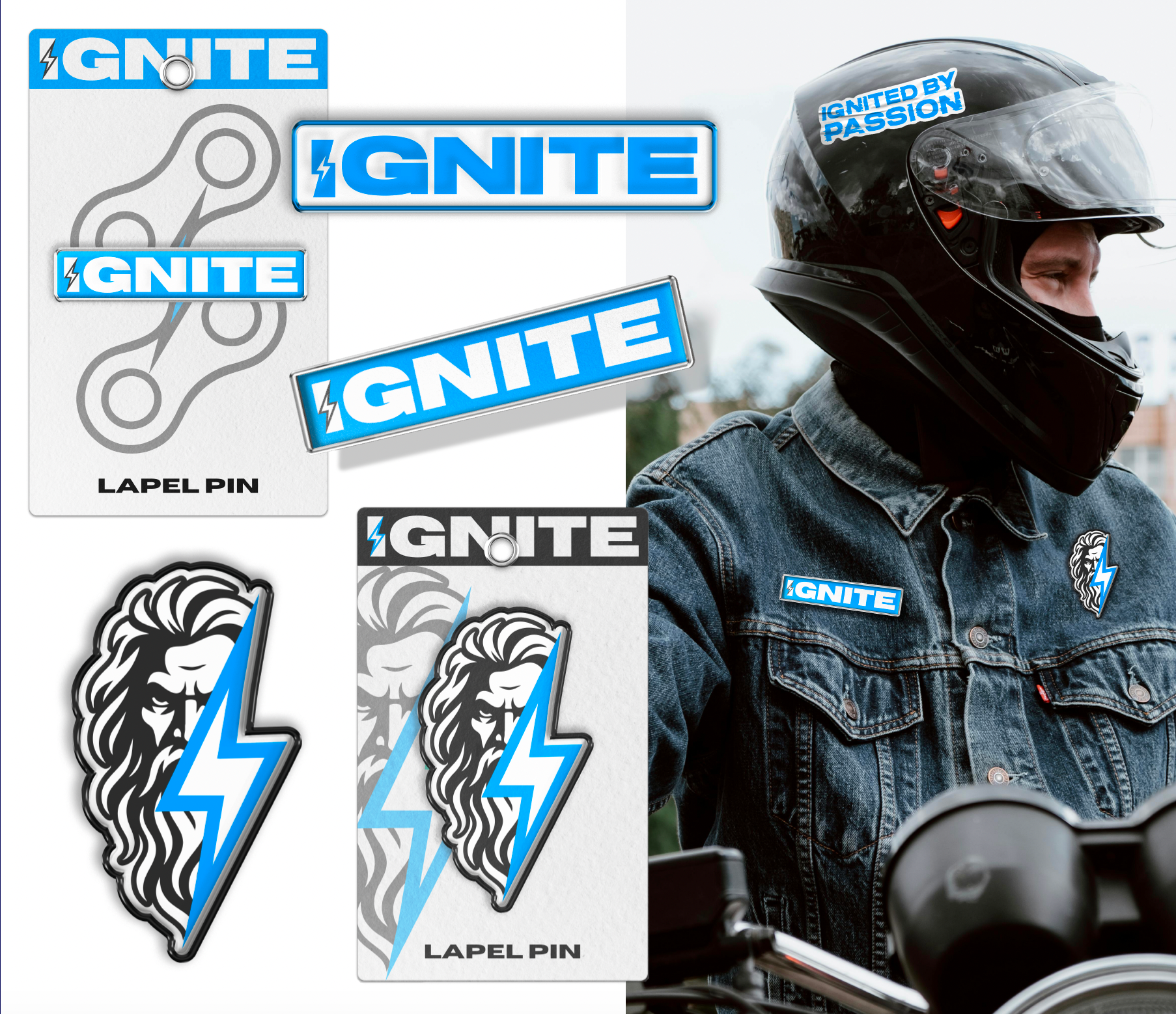
- Apparel, sticker, lapel pin and merchandise mockups
- Website and social media direction mockups
- A 44-page brand guidelines document
- Final asset packaging for web, print, signage and future growth
I was given full creative control to take IGNITE from nothing to a fully realised, launch-ready brand.
Strategy First, Always
Before a single line was drawn, a significant amount of time was spent on research and strategy.
Rather than designing for launch alone, every decision was made with long-term growth in mind ensuring the identity would remain relevant as IGNITE expands its product offering, physical presence, and digital footprint.
Every decision was grounded in:
- Industry analysis (both traditional motorsports and EV brands)
- Colour psychology
- Audience behaviour and perception
- Scalability across physical and digital touchpoints
- Long-term brand longevity
The core strategic insight was simple but powerful:
IGNITE doesn’t force riders to choose between petrol or electric - it connects them.
That idea became the foundation for everything that followed.
The Visual Identity
The Logo System
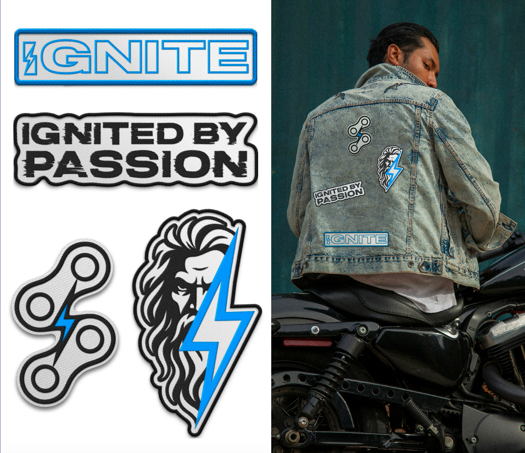
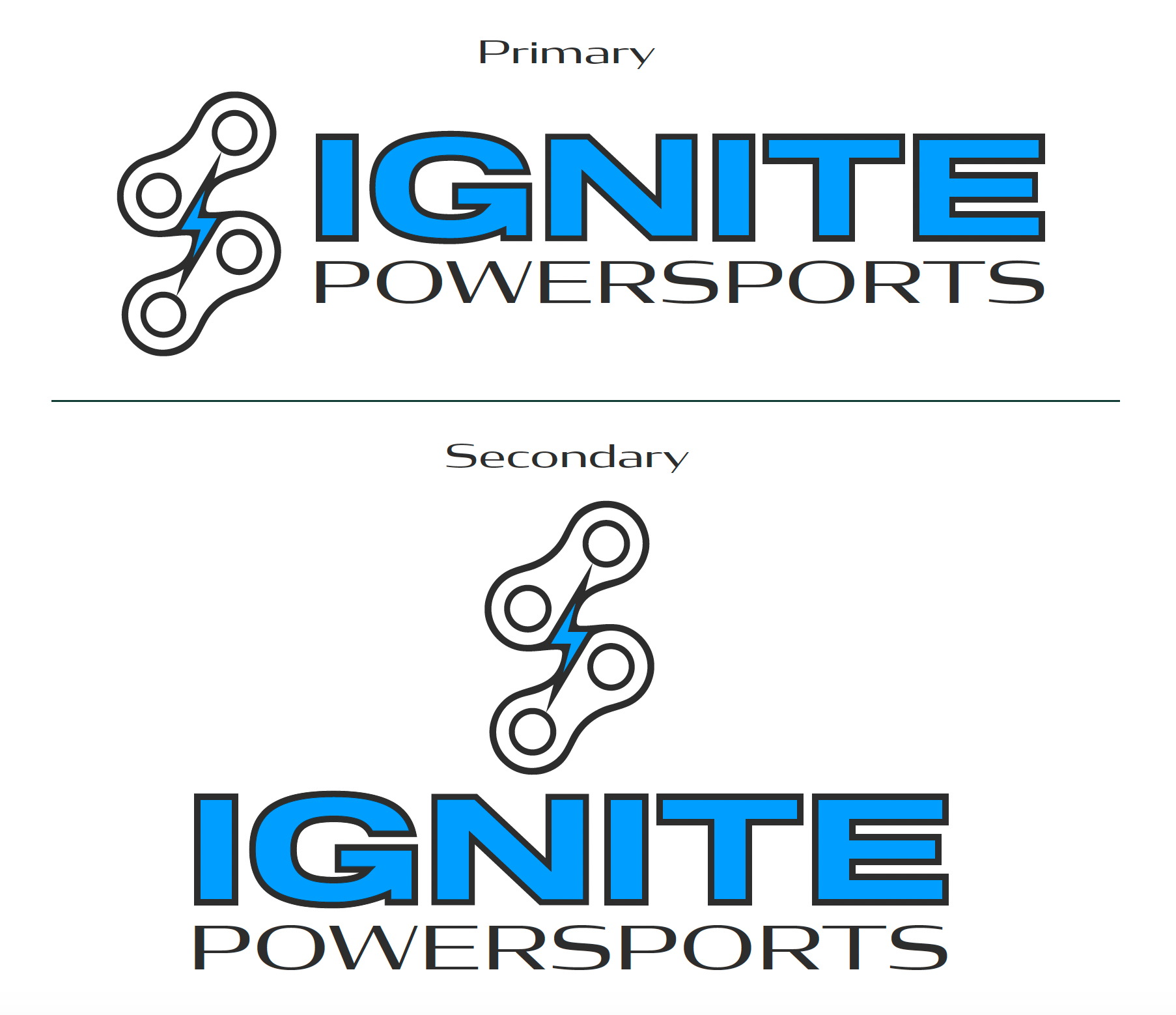
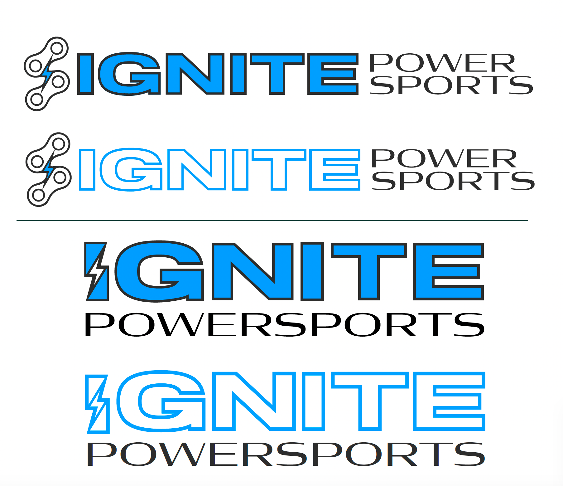
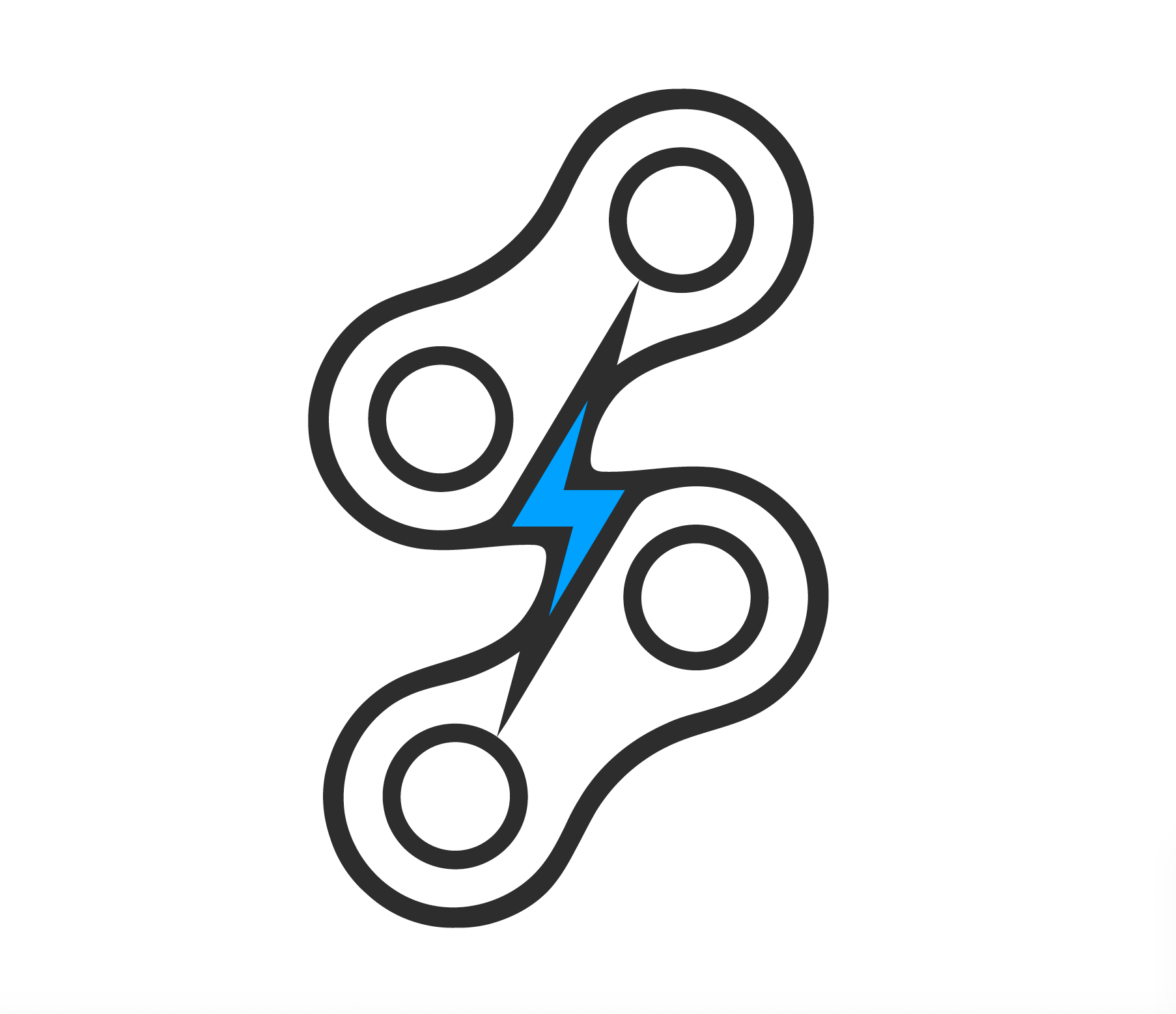
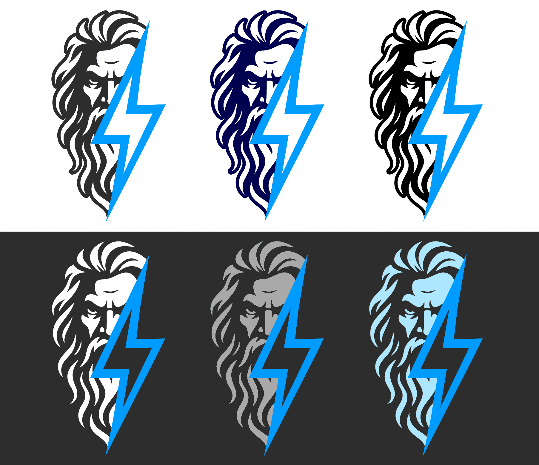
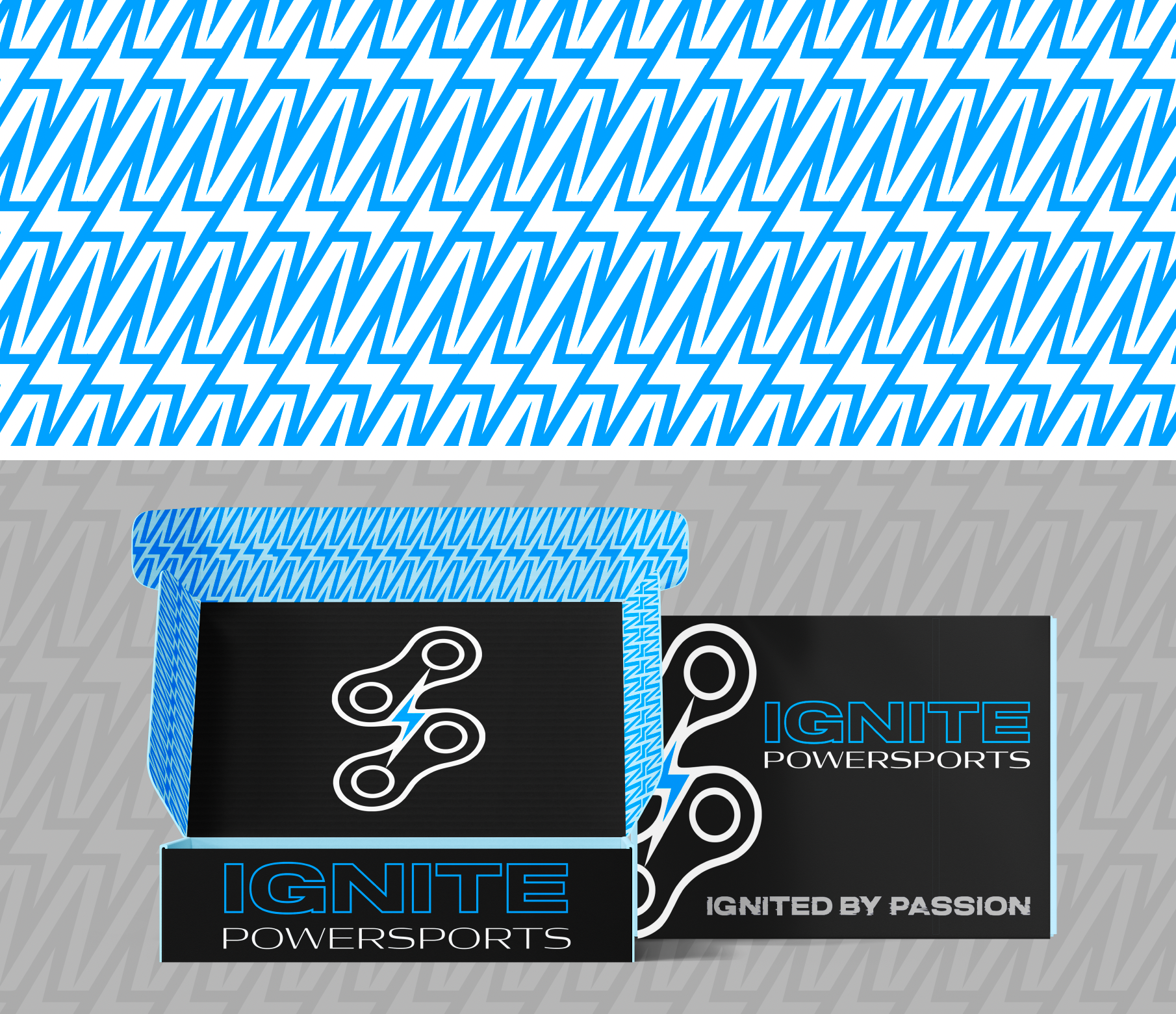
The primary logo was designed to visually represent the bridge between tradition and innovation. A chain element symbolises mechanical heritage and connection while the lightning bolt represents electric power, energy and the future.
Rather than creating multiple disconnected logos, the system was designed to be modular and flexible, with:
- A primary logo
- Secondary and horizontal options
- A simplified brandmark
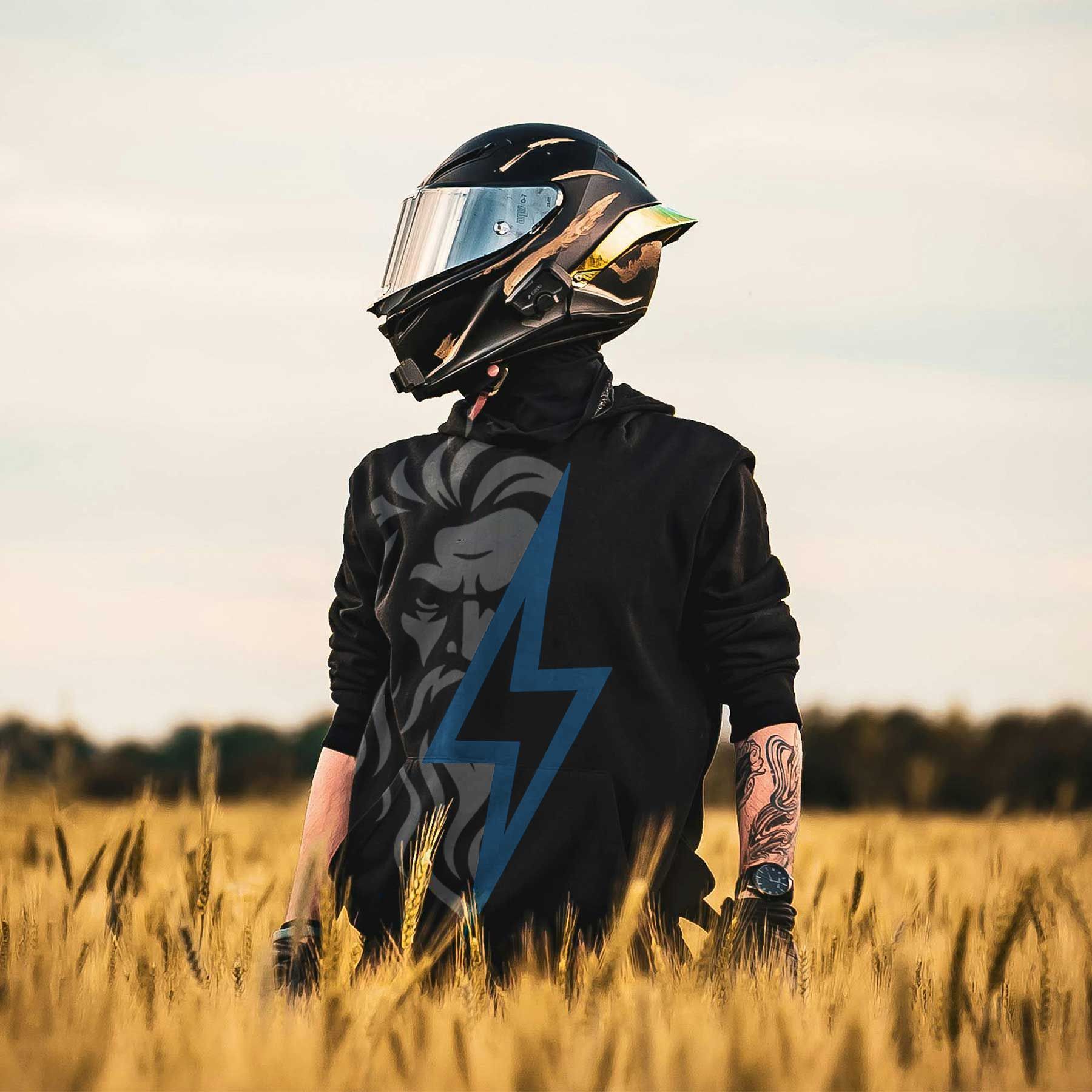
- A bold signature graphic (Zeus) designed specifically for apparel and merchandise
This allows IGNITE to maintain consistency while still having variety across different applications.
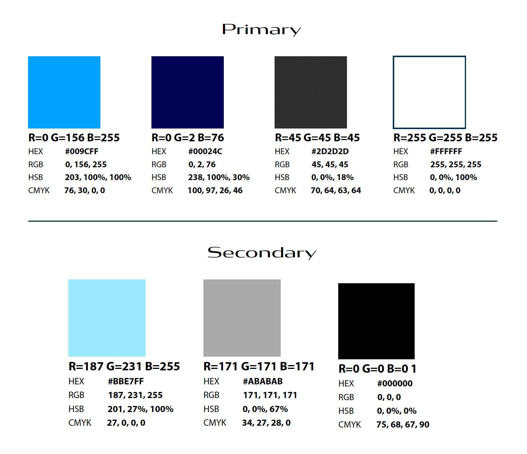
Colour Exploration & Decision Making
Colour played a critical role in shaping the brand’s perception.
Rather than forcing a single direction, I presented two fully developed colour palettes, allowing the client to feel involved in a meaningful, non-overwhelming way.
This approach wasn’t about indecision — it was about collaboration and confidence.
Ultimately, IGNITE selected the Electric Blue & Grey palette, a proven and trusted combination in the powersports and EV space, reinforced through bold imagery and strong visual systems.
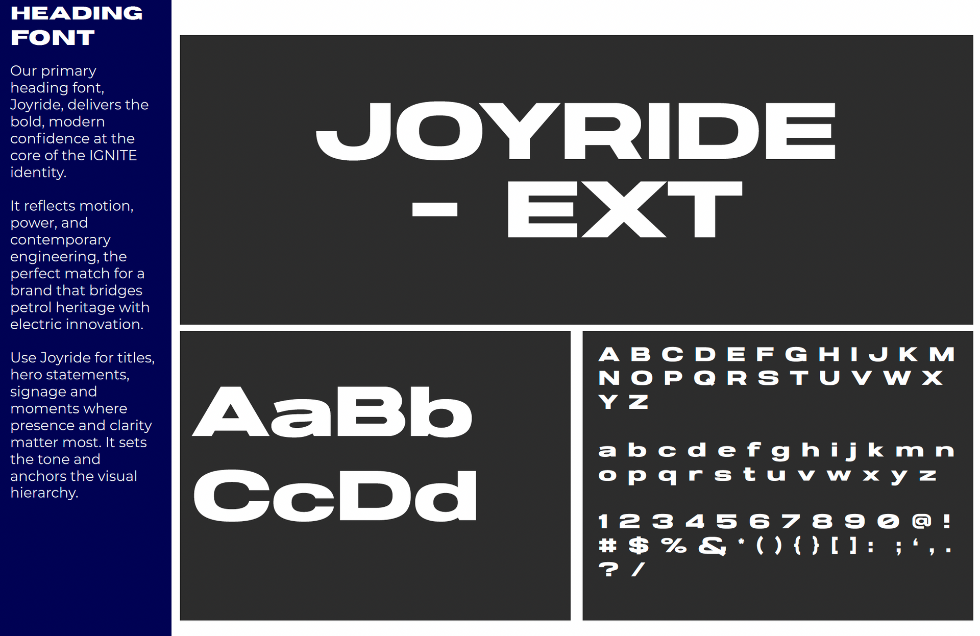
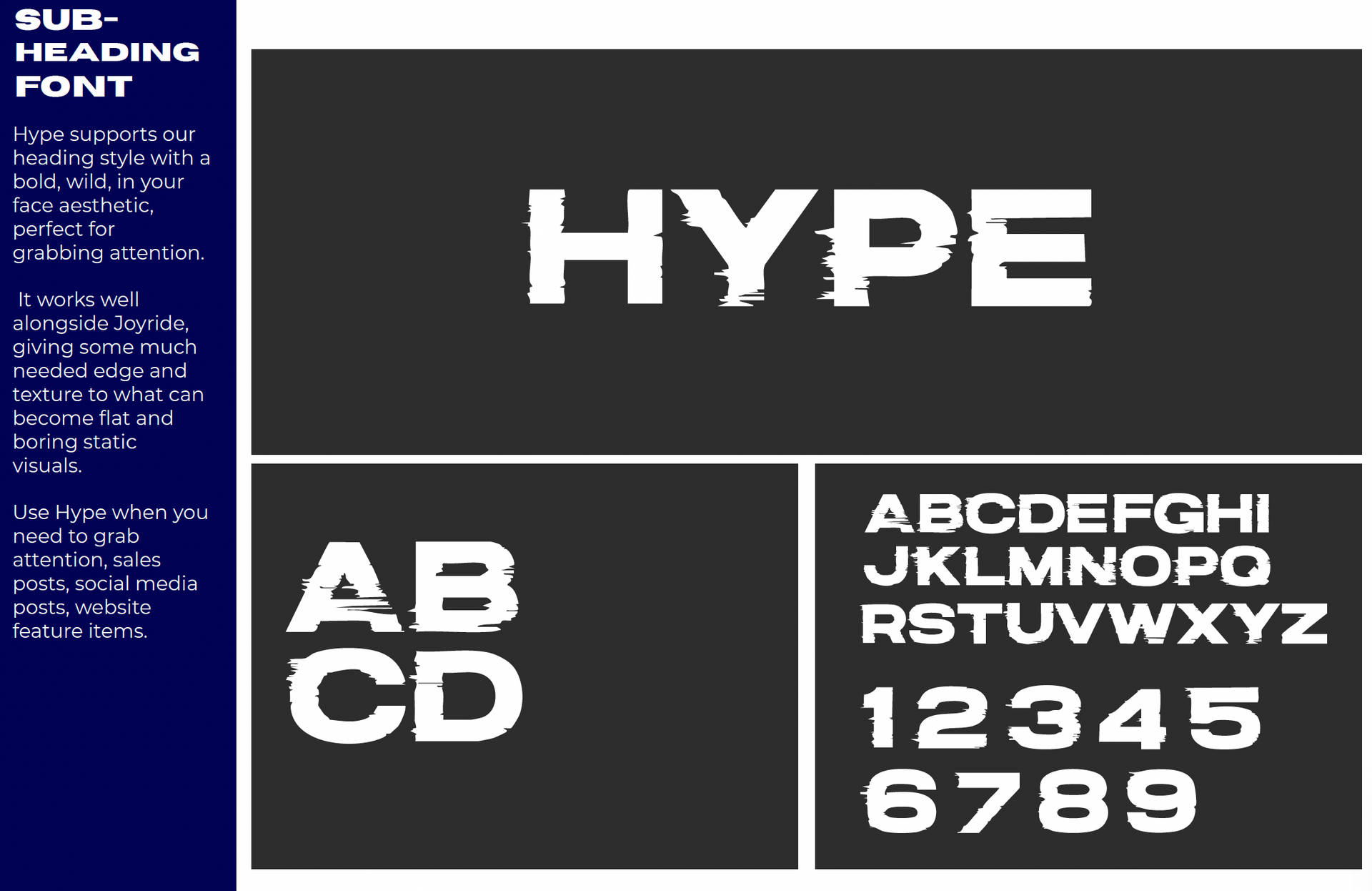
Typography & Font Pairing
Typography played a critical role in shaping how IGNITE feels as a brand — not just how it looks.
The goal was to strike a balance between confidence, clarity and personality, ensuring the type system could work across everything from large-scale signage and apparel to website UI and social media content.
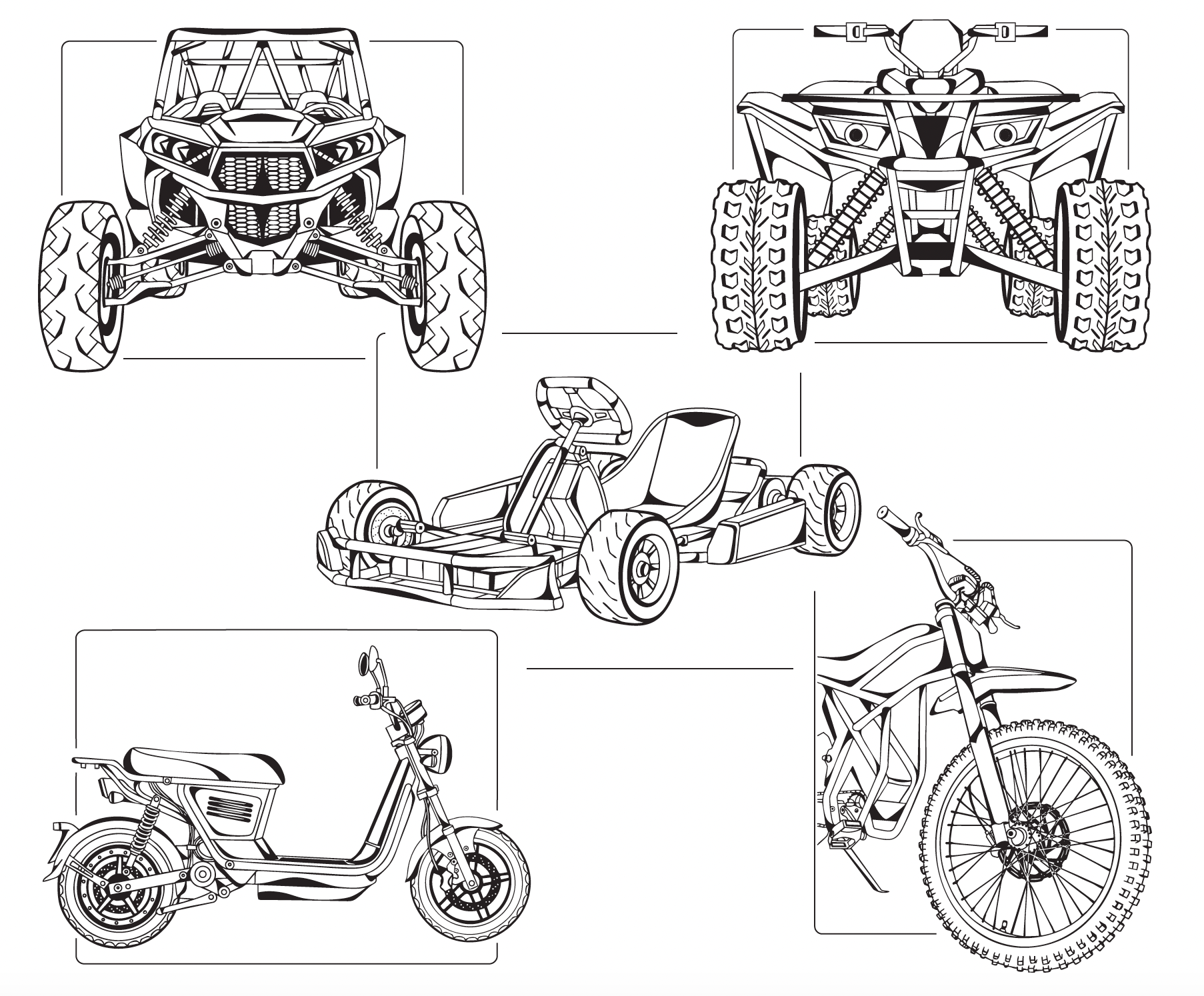
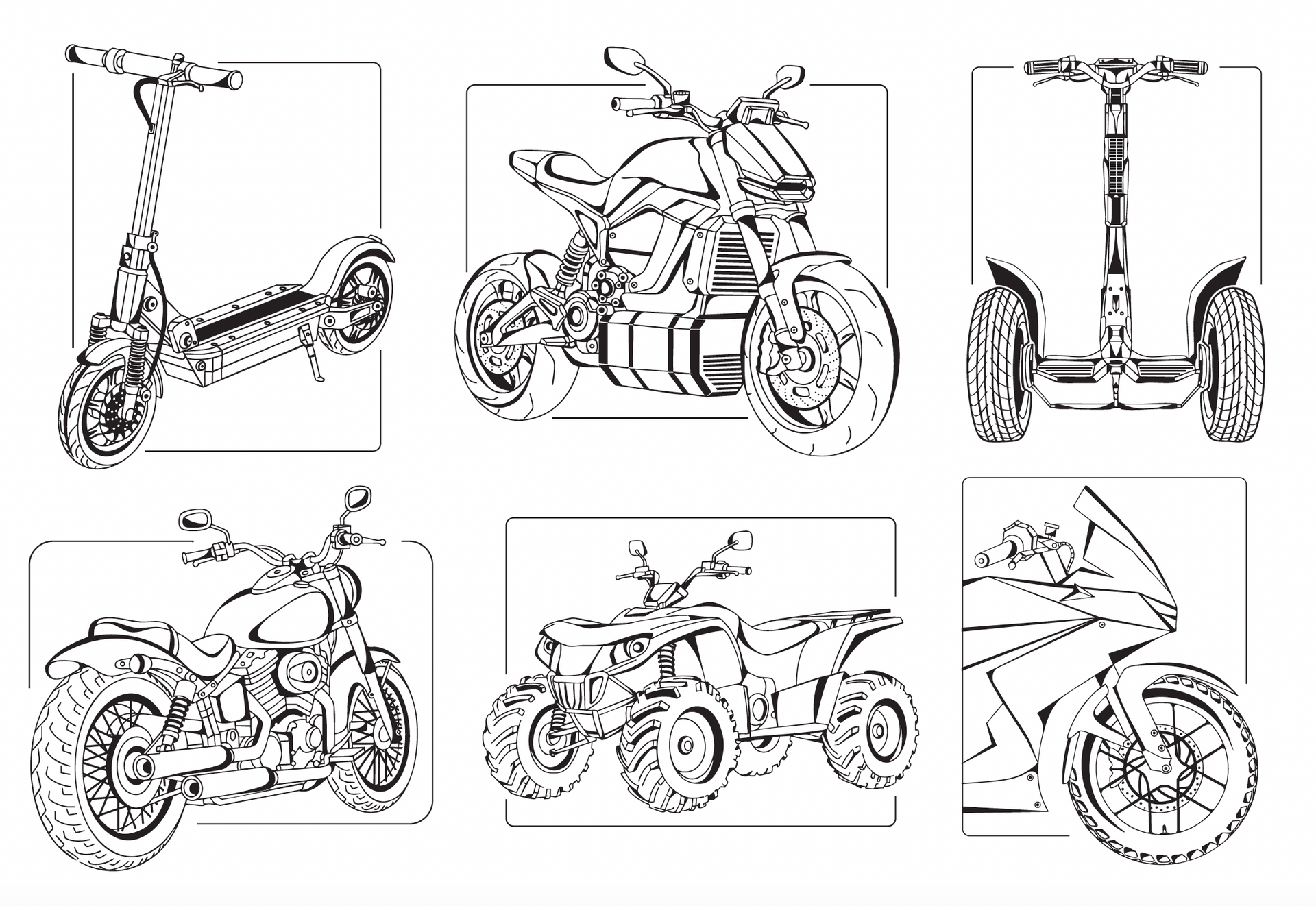
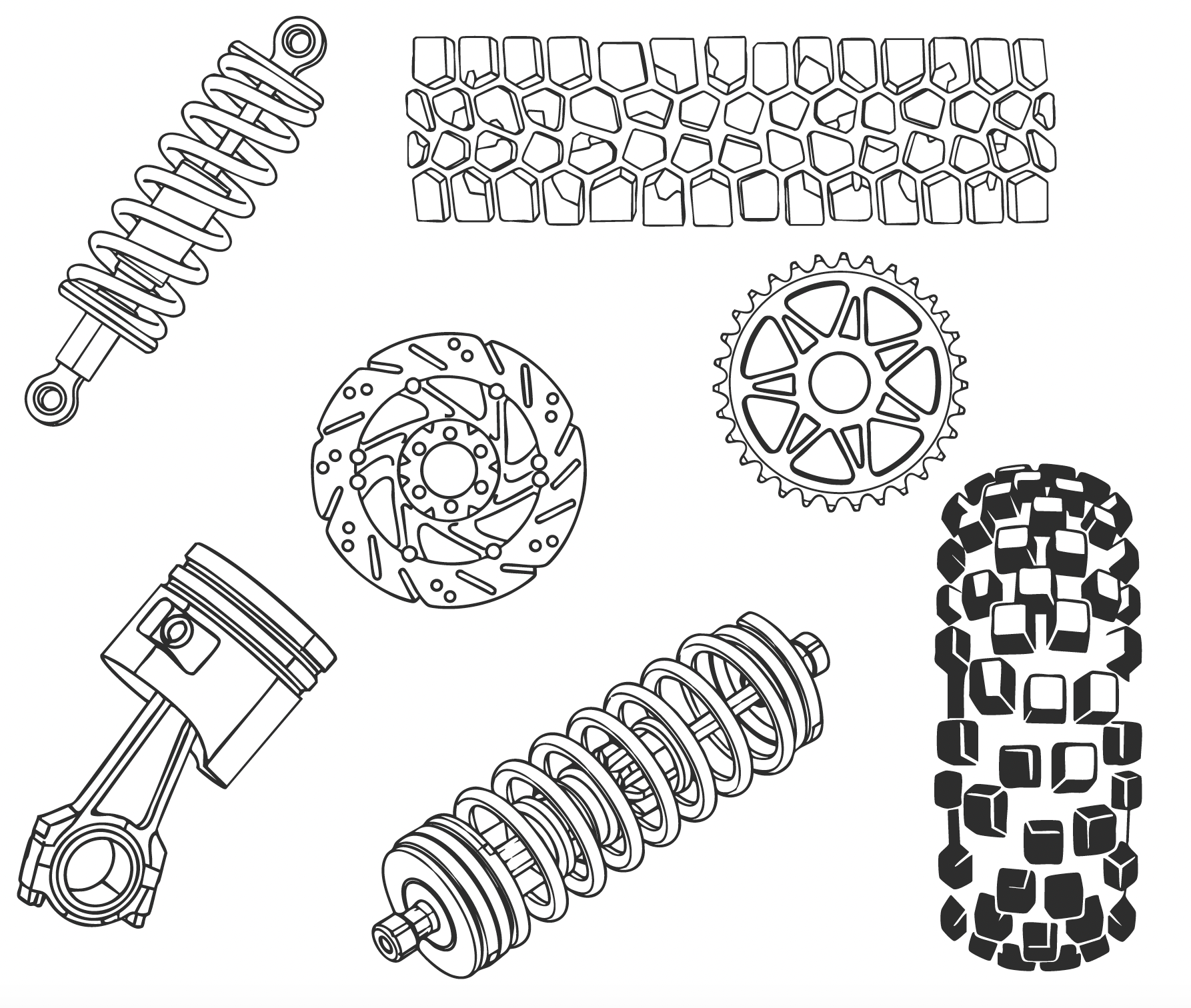
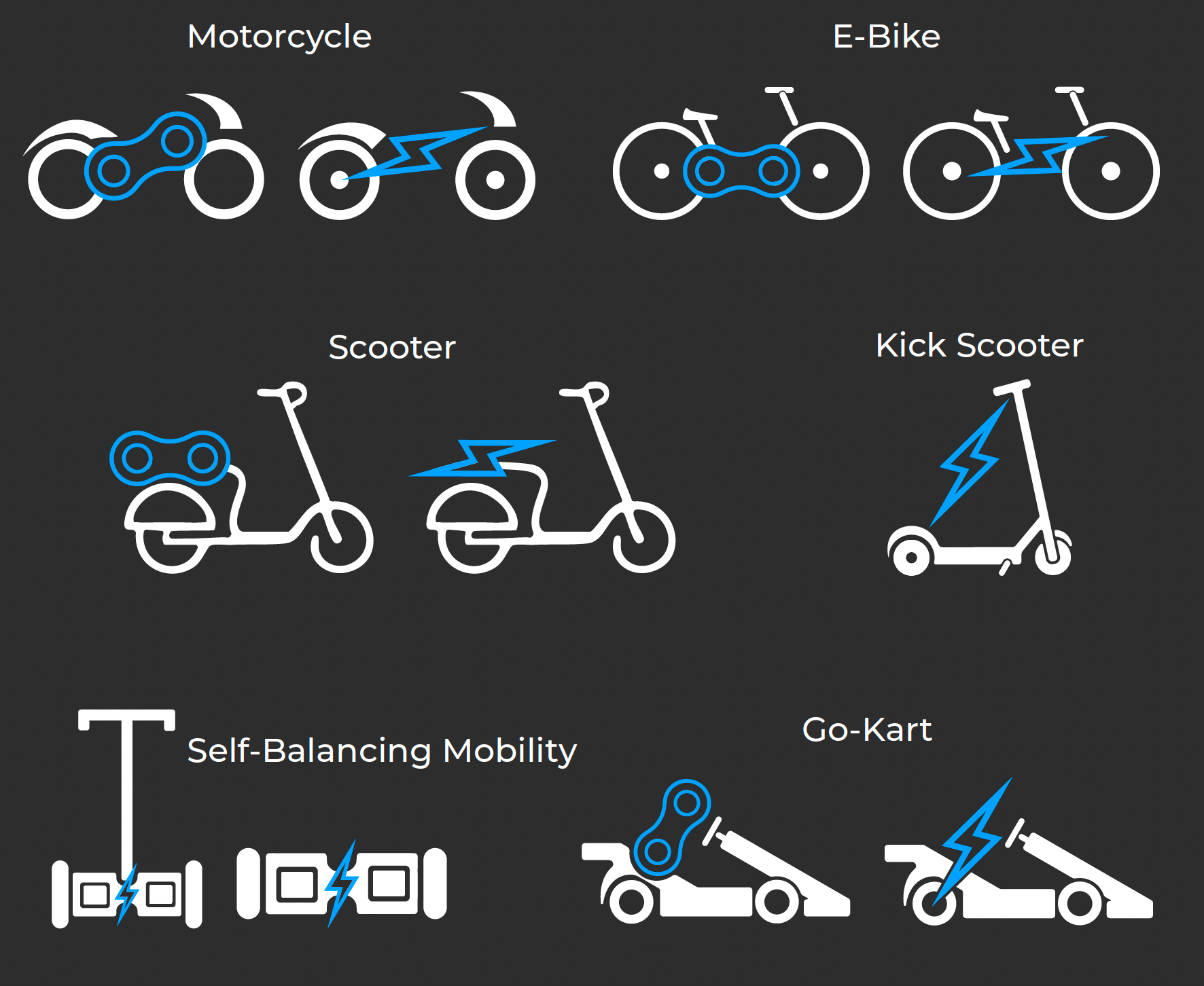
Custom Illustrations & Brand Assets
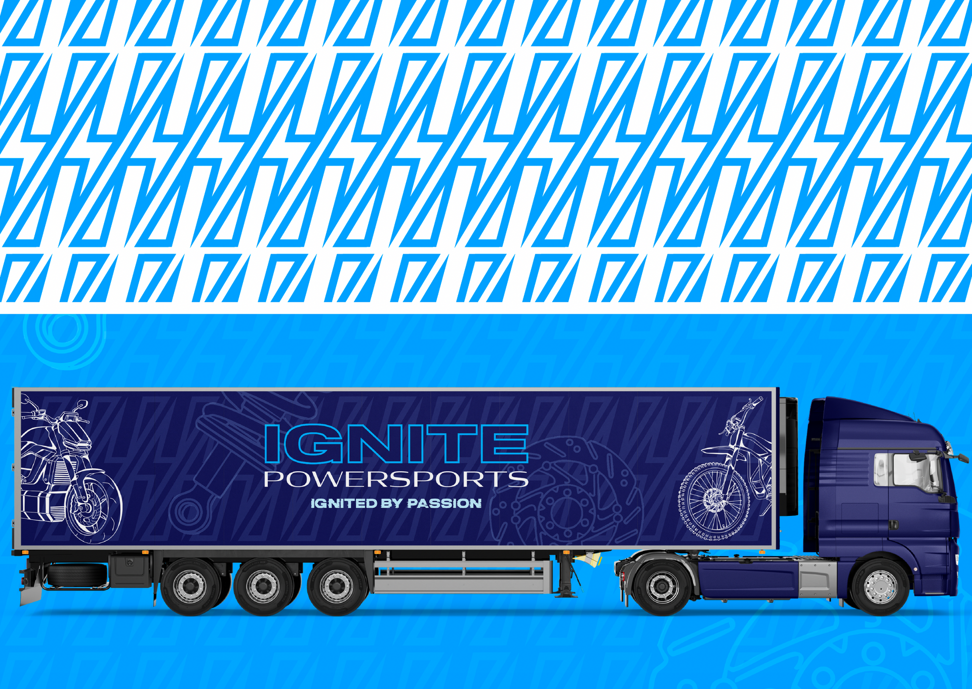
To elevate IGNITE above typical dealerships, I created a suite of entirely custom vehicle illustrations - including motorcycles, ATVs, UTVs, electric bikes, scooters + more.
These illustrations:
- Are completely original and brand-owned
- Add a premium, high-end feel
- Future-proof the brand as new vehicles are introduced
Supporting assets such as tyre treads, mechanical line art, and lightning-based background graphics further reinforce the brand’s energy and identity without overwhelming the design.
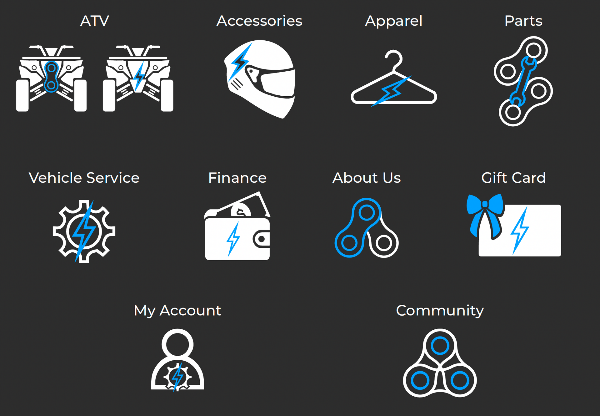
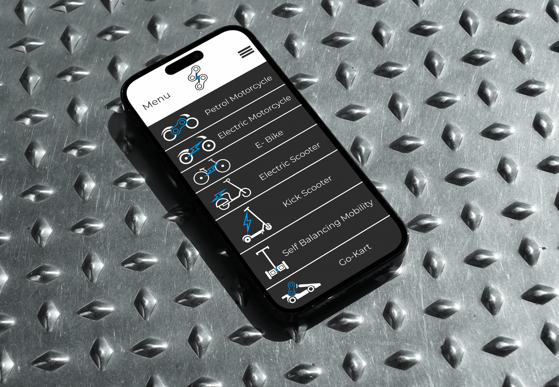
Icons + Brand Patterns
IGNITE’s identity extends beyond big hero moments.
A full set of 22 custom icons was designed for website navigation + social media use, alongside repeatable patterns and background assets to ensure the brand feels cohesive at every touchpoint even in the smallest details.
This level of detail ensures the brand feels intentional, professional, and considered, not pieced together.
Final Thoughts
IGNITE Powersports is a clear example of what happens when branding is approached as a system, not a single deliverable. Every element from the logo and typography through to illustrations, icons and supporting assets was designed to work together, scale seamlessly + support the business well beyond launch.
This project wasn’t about following trends or fitting into what a powersports brand is “supposed” to look like. It was about creating a visual identity that reflects where the industry is heading, while still respecting the heritage that built it.
The result is a brand that feels confident, modern, and ready for growth, one that can evolve alongside IGNITE as it expands into new products, platforms, and markets.
If you’re a founder or business owner looking for more than just a logo and want a brand built with clarity, intention + long-term strategy in mind
- I’d love to work with you.
THE DISARMING DOWNLOAD