unpacked
Brand Strategy & Positioning
Target Audience Research & Refining
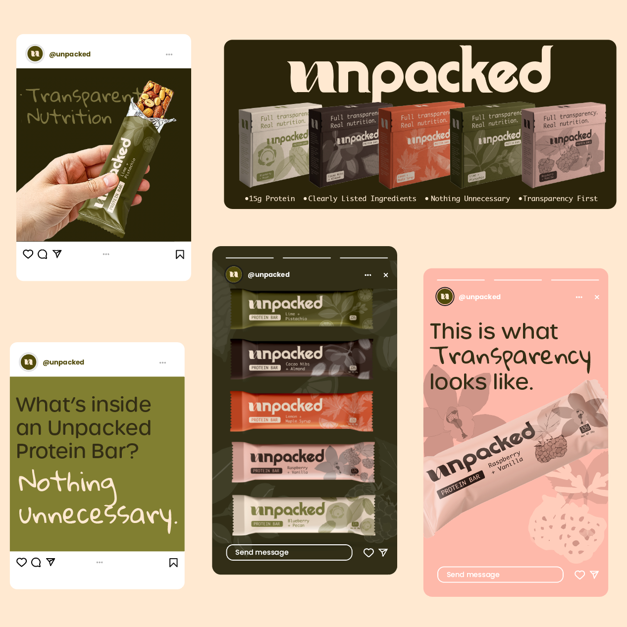
Full Visual Identity Design
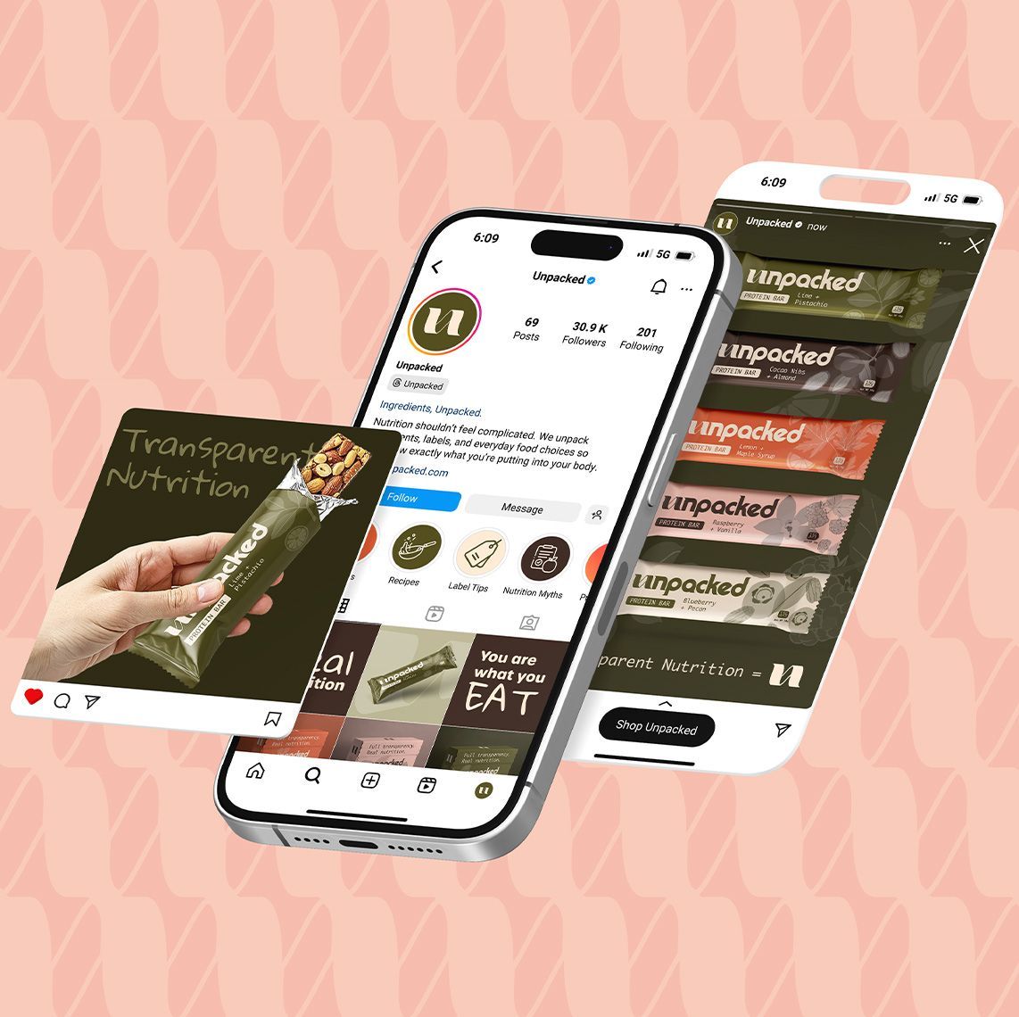
Social Media Strategy & Positioning
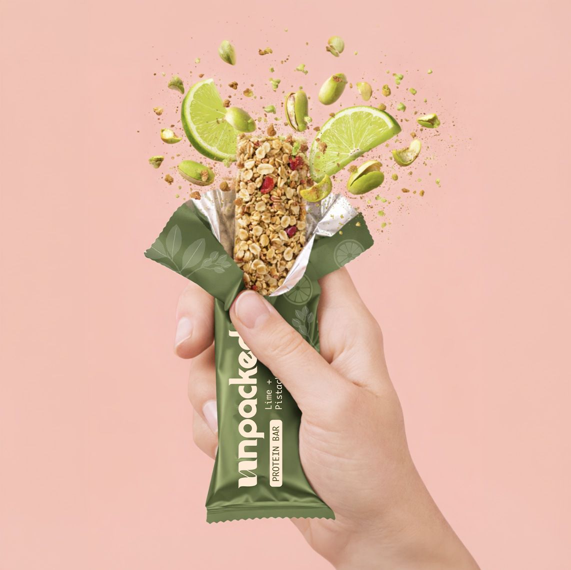
Custom Illustration Design
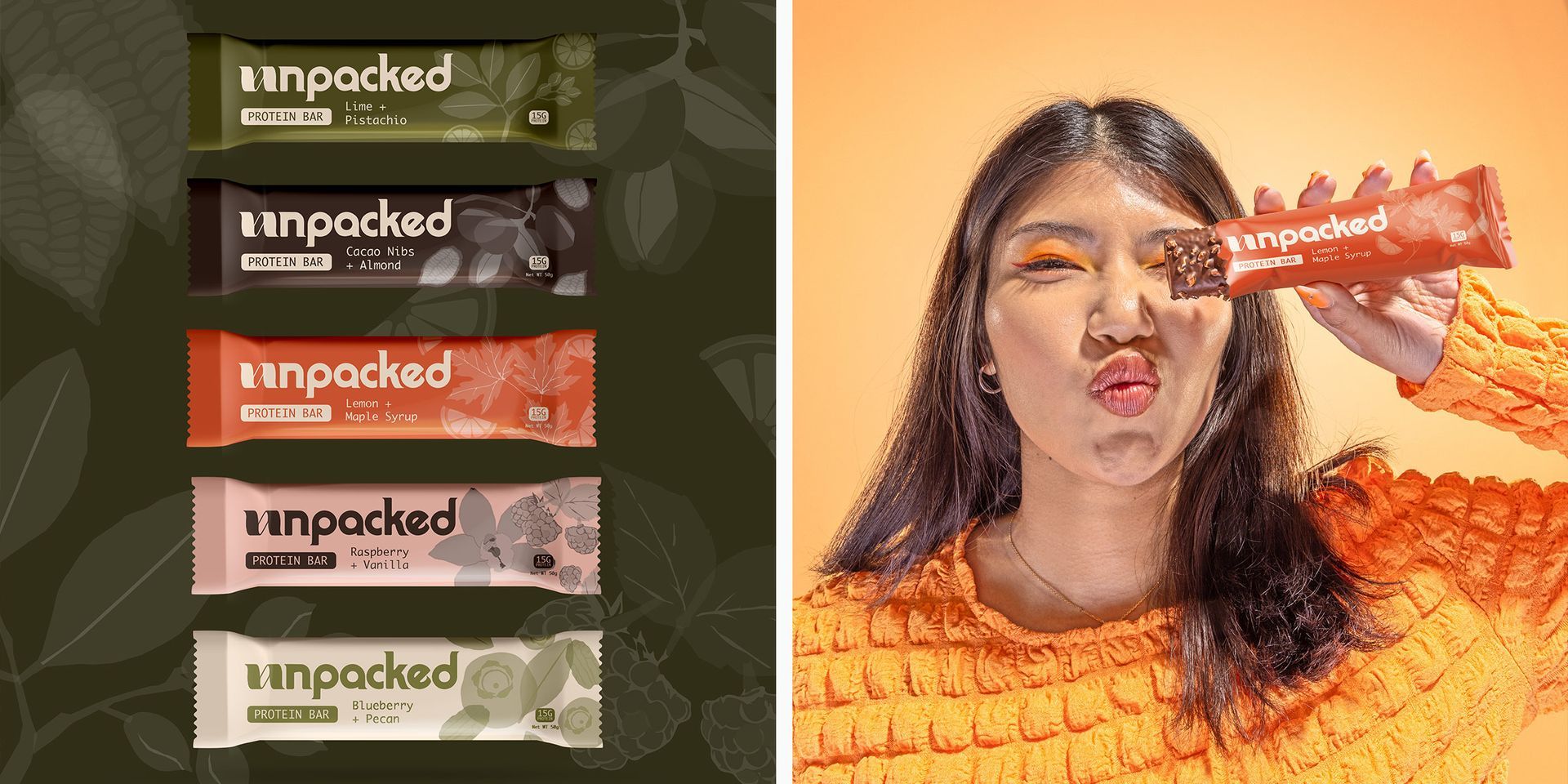
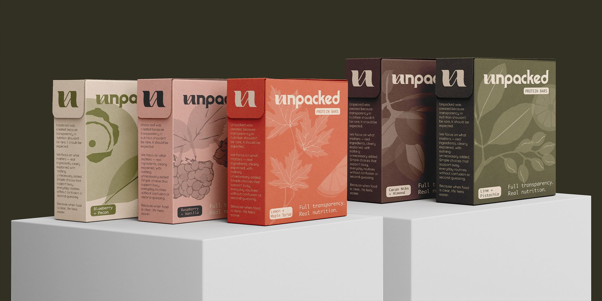
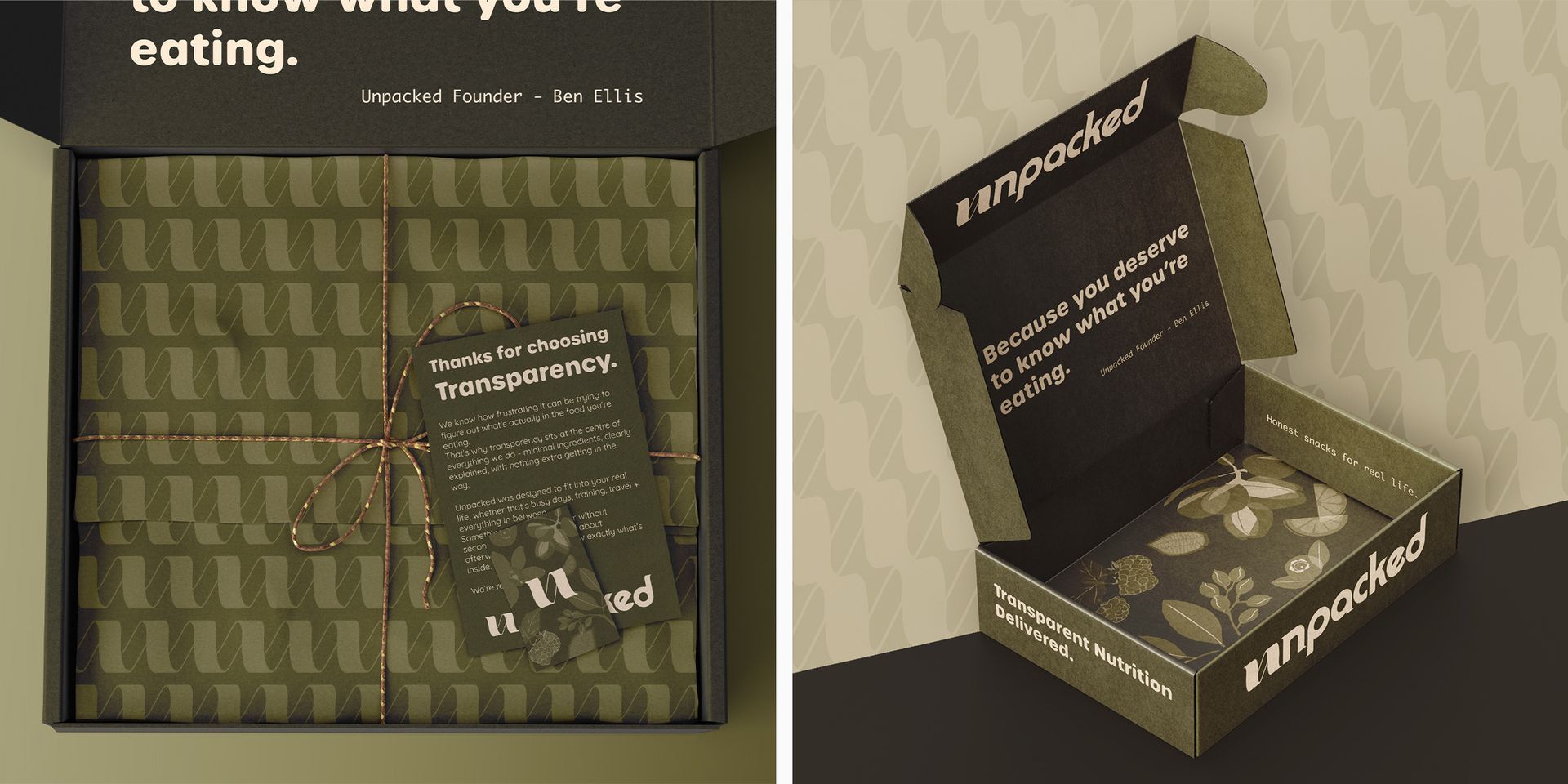
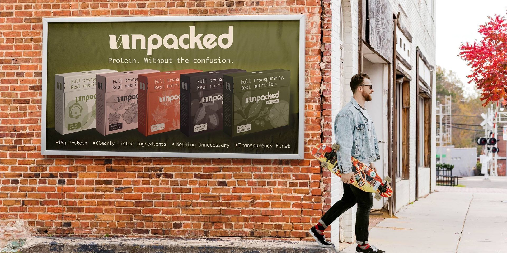
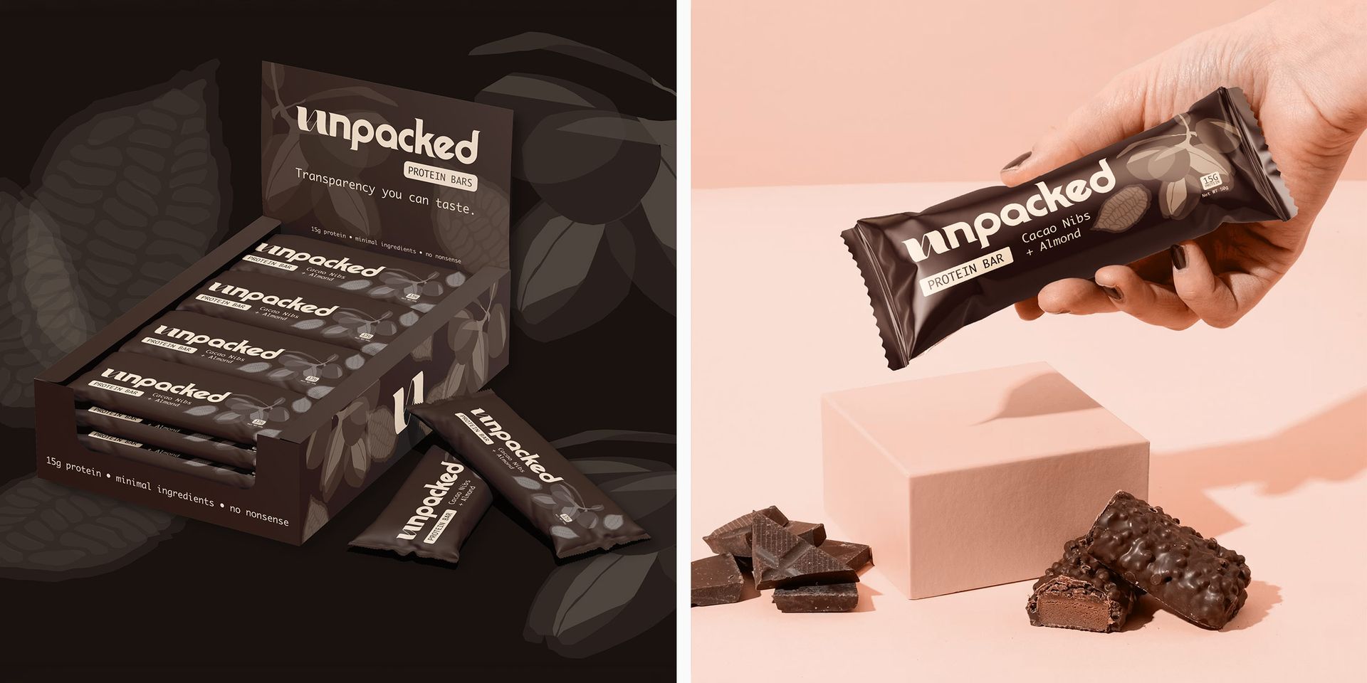
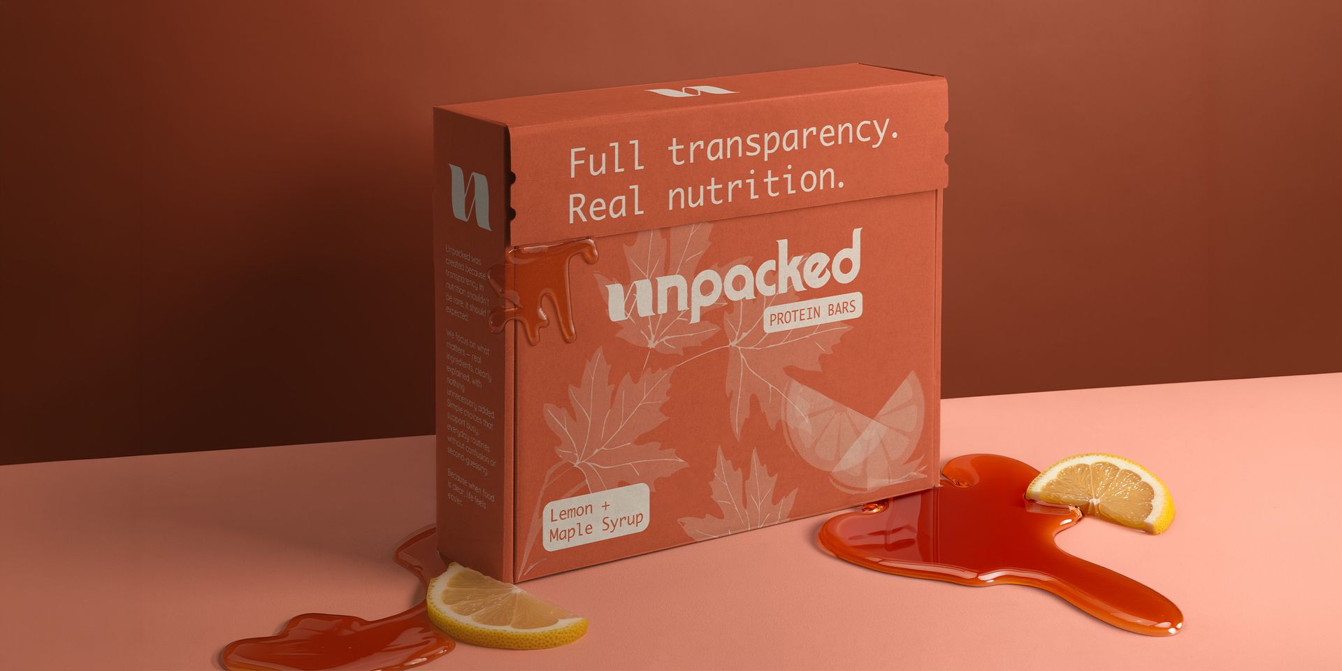
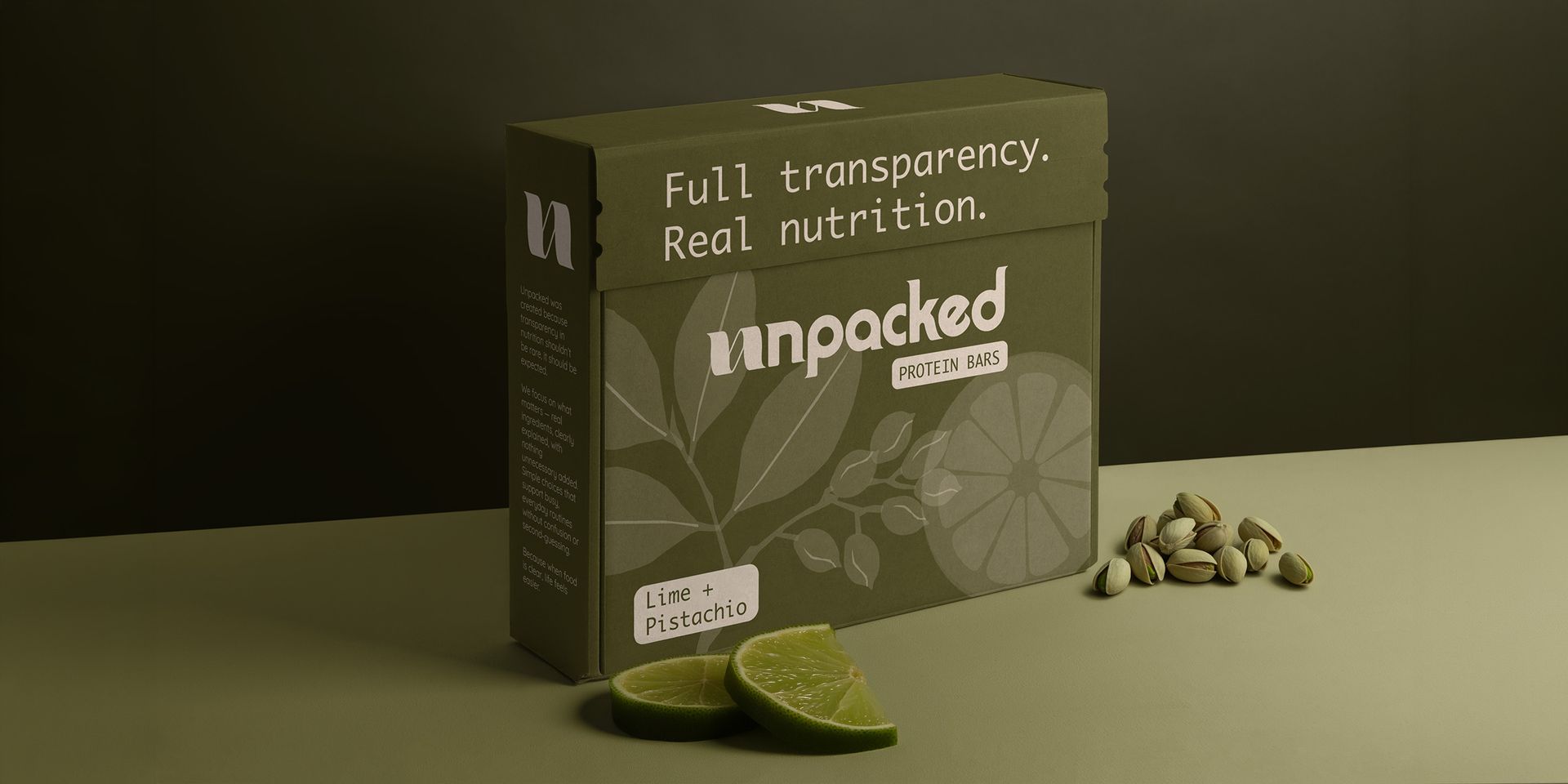
Packaging Design
about this project
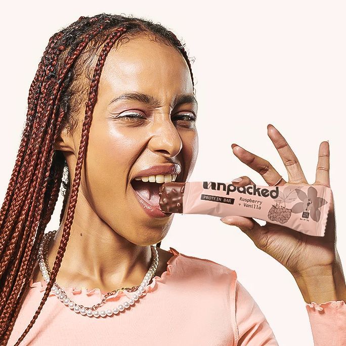
Unpacked came in with a powerful idea, make nutrition simple and transparent but they needed a brand that actually proved that visually.
I built a clean, honest identity that cuts through the noise of the health industry, turning confusion into clarity and helping customers trust what they’re putting in their bodies.
The health food space is crowded with overcomplicated claims, confusing packaging, and brands that say a lot without actually saying anything.
Unpacked needed to stand out by doing the opposite, being clear, honest and instantly easy to understand.
The identity was built around simplicity and transparency from clean typography and structured layouts to ingredient-led visuals that make information feel accessible, not overwhelming.
Every element was designed to remove friction and build trust at a glance.
The result is a brand that feels approachable, credible, and easy to navigate giving Unpacked a strong, confident presence in a space where clarity is rare.
It doesn’t just look good, it communicates exactly what the product stands for.


What to see the full design process I undertook for Unpacked?
Check it out here
See Next Project
Mystic vibes, sweary mantras and branding that cleanses your energy… or your enemies.