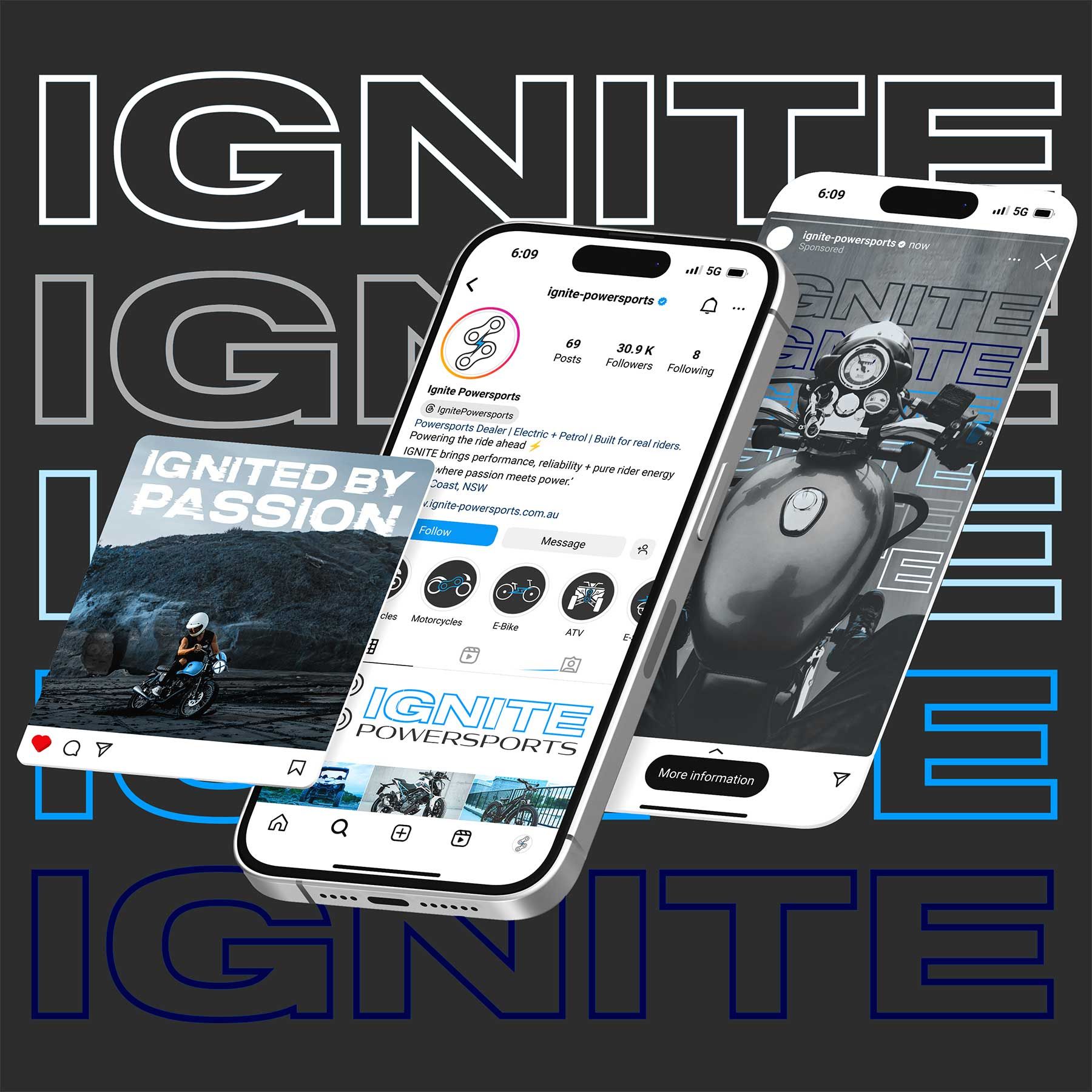
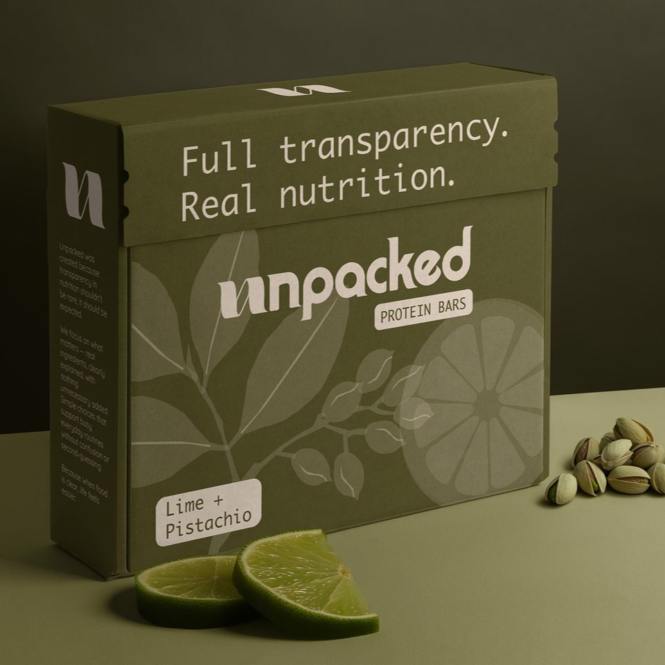
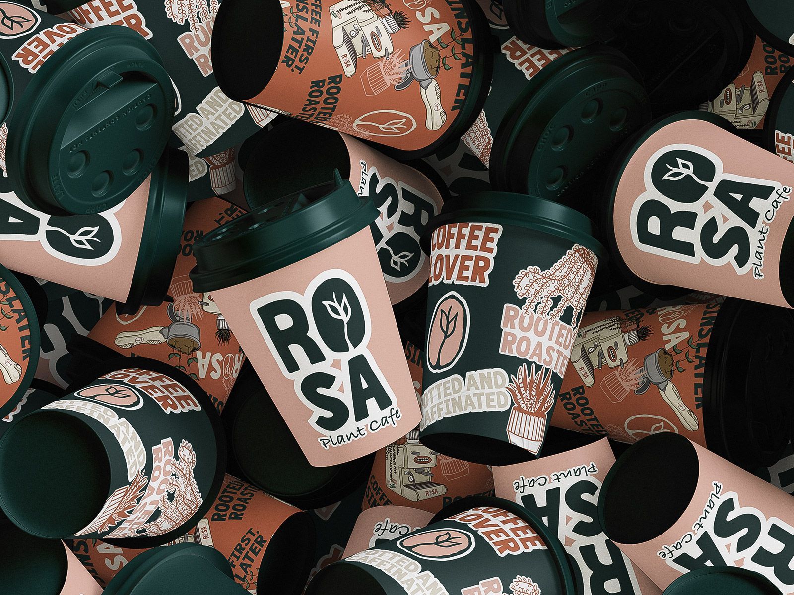
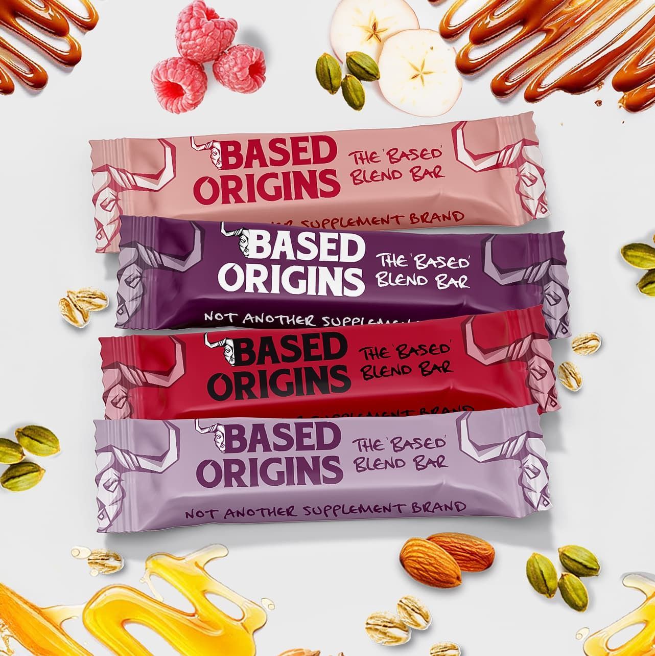
When Rosa Plant Café came knocking + wanted a brand that stood out in a crowded market of beige cafes. I delivered a bold, personality-packed identity with bold colours, punchy type + branding that turns heads + fills cups.
For Spiritual AF, the brief was clear: no beige, no basic, no clichés. So I delivered a bold, mystical brand identity dripping in attitude. From logo to social templates, everything was crafted to help this unapologetic spiritual brand stand out in a sea of soft pastels.
Based Origins isn’t your average wellness brand so I was going to make sure it didnt look like one. I tore up the cliché playbook and built a visual identity dripping in attitude, earthy grit, and bold personality.
LIT is a brand that owns the night. This identity channels neon energy, loud typography +high-impact visuals to every touchpoint giving their products a glow-up worth bragging about, just the way their audience likes it.
This one was about giving a one-man photography powerhouse a visual identity with as much edge as his shots. From logo to socials, everything was designed to capture attention and leave an imprint as sharp as his lens work.
Want this for your brand? Here’s how I do it