Behind the Brand - Spiritual AF
Let's build a spiritual brand identity that slaps with meaning, edge and style. Tap into rebel energy + strategy.
A bold brand for bold souls.
Disarming Designs for Spiritual AF - Spiritual AF is the unapologetic spiritual brand run by Leah — a powerhouse woman blending numerology and Pleiadian lightwork to help clients unpack trauma, break soul contracts, and unlock their best selves. She’s not your typical crystal-hugging tarot reader. Leah wanted bold, high-end celestial vibes with none of the cliché woo-woo fluff and her branding had to reflect that One that spoke to modern mystics without falling into the cliché trap. And that’s exactly what we gave her.
In this case study, I’ll break down the strategy, creative direction and design decisions that brought Spiritual AF’s rebellious yet high-end branding to life.
The Brief
Leah came to me needing a brand identity as bold as her business name. It had to feel spiritual without falling into the stereotypical tarot card aesthetic. No hippy fonts, no pastel mandalas, no dime-store crystal shop vibes. She wanted something high-end, grounded in nature, tied to sacred geometry and the stars — a look that felt as powerful and direct as her work.
Project Snapshot
Client: Leah - Spiritual AF
Industry: Numerology & Pleiadian Lightwork
Services Delivered:
Brand strategy, brand identity design, custom illustrations, social media, packaging mockups, brand guidelines, brand collateral.
Target Audience: Women aged 20–40 prioritising mental wellness, open to alternative healing, spiritually curious but craving modern, elevated brand experiences.
The Challenge
Leah’s brand needed to be:
- As bold as the name
- Different from stereotypical spiritual brands
- High-end, polished and aligned with nature and the cosmos
- Visually balancing grounded, earthy forest energy with celestial gold accents
The biggest hurdle? Navigating the fine line between sacred, spiritual symbolism and cheeky, rebellious energy without losing authenticity or attracting the wrong kind of ‘woo-woo’ vibe.
research
I started where every good brand identity should — strategy. I came up with the Brand Concept - Modern celestial meets forest grounding.
Key research areas:
• The differences between numerology, lightwork, and tarot
• Sacred geometry as a visual representation of energetic alignment
• Modern interpretations of celestial symbolism
• Colour psychology and nature’s calming influences
Creative Direction
Nature + Galaxy
Drawing inspiration from Strickland Forest where Leah grounds herself and the celestial glow of Pleiadian star systems, I anchored the palette in lush greens and luxe golds.
Sacred Geometry
To steer clear of tarot tropes, I leaned into numerology’s visual cousin: sacred geometry. These precise, beautiful patterns added spiritual symbolism in a modern, minimal way.
Design Solutions
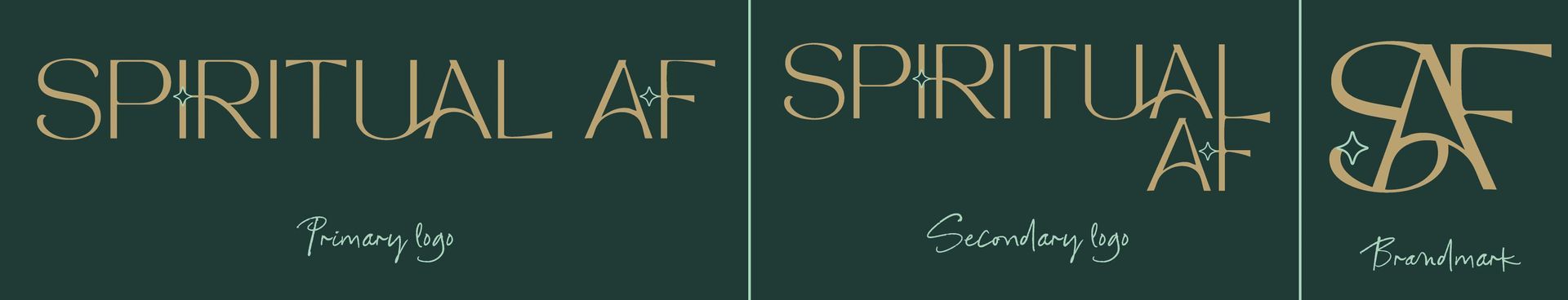
Logo Suite
A clean, modern wordmark balanced connected subtly to show Leah's use of energy work + sacred geometry-based brandmark anchoring the brand in both ancient wisdom and contemporary design.
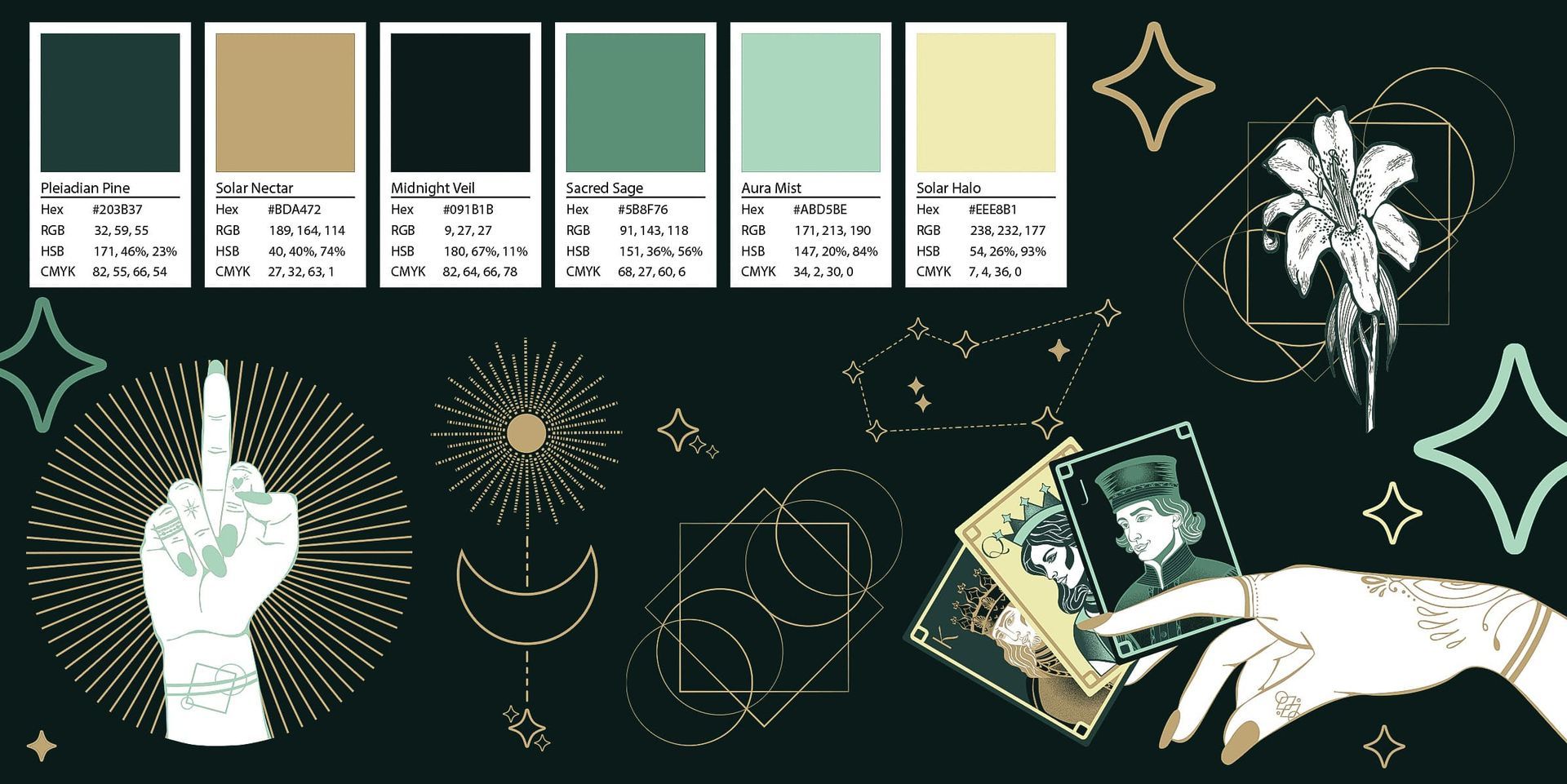
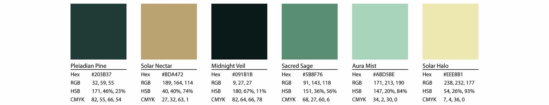
Colour Palette
Inspired by the greens of Strickland Forest (where Leah grounds herself) and the golden glow of Pleiadian light. Deep greens paired with rich gold and dusky neutrals reflect both earthy wisdom and cosmic connection.
Typography
Primary Font: The main font flows like the energy Leah works with — organic, fluid, connected -Tan - Mon Cheri from Creative Market
Secondary Font: The secondary typeface resembles handwritten notes, a nod to Leah’s practice of jotting down intuitive messages during client sessions - Manhattan Cocktails from Creative Market
Body:
Clean, minimalist sans-serif, easy to read font - Poppins

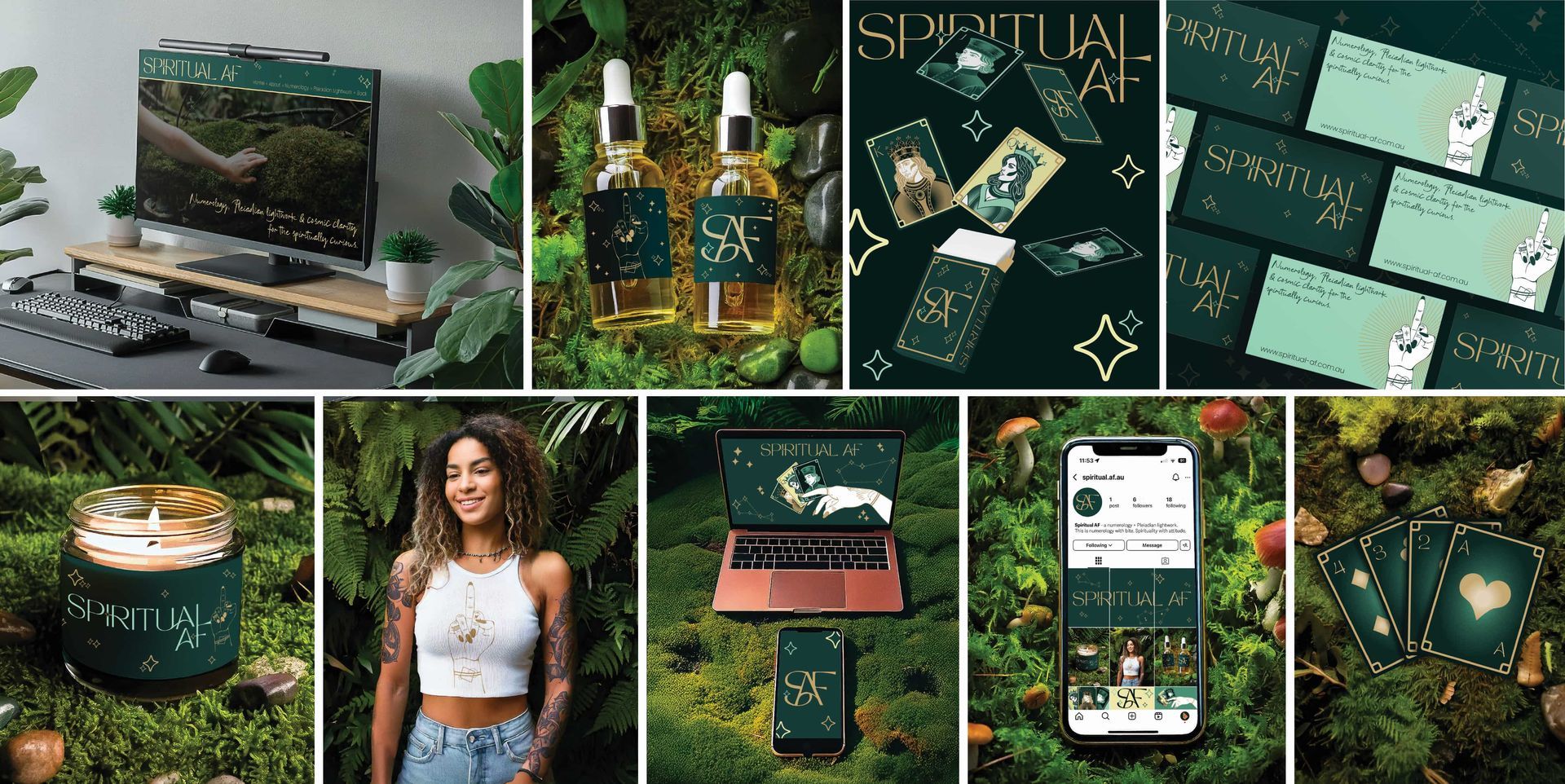
Mockups & Brand Assets
To show the brand in context, I designed:
- Instagram post layouts
- Website home page concept
- Product mockups: candle, essential oil bottles, tissue paper, tote bag
- Custom numerology card deck
- Clothing merch
- Branded business cards & thank you cards
Results
Leah was thrilled with the final brand — bold, modern, spiritually connected and like nothing else in the space. The branding now speaks directly to her dream clients while reflecting the depth and confidence of her work.
What I Loved About This Project
Blending spiritual energy with rebellious attitude. Balancing grounding greens with cosmic golds. Designing bold brands for bold souls is what Disarming Designs is built for.
Key Takeaways
Whilst I dabble a little in spirituality myself it was never going to be enough knowledge to design a brand so research was key in order to be able to come up with a strong strategy and from that I could build visuals. I immersed myself in numerology, Pleiadian lightwork and sacred geometry to build a brand that was symbolically accurate, modern and true to Leah’s personality.
It reinforced how powerful a bold, authentic brand can be when it connects both strategically and emotionally with its audience.
- Modern spiritual brands don’t need to look cliché.
- Research is everything - learn your client’s world, and then push it.
- Your visuals should reflect your voice. Leah’s brand was always going to be bold AF, and now it looks it.
Let get your brand looking Sharp!
THE DISARMING DOWNLOAD