HER FYTE CLUB
Strategic Brand Identity Design for a Female-Only Gym
Her Fyte Club is a female-only gym built around strength, confidence, community and creating a space where females can train, grow and challenge themselves without judgement.
The challenge wasn't simply to create a logo for a new gym. It was to build a strategic brand identity and visual identity system capable of expressing what Her Fyte Club stands for while giving the business the tools to communicate consistently as it grows.
PROJECT DETAILS
Client: Her Fyte Club
Industry: Fitness / Women's Fitness
Services: Brand Strategy, Visual Identity Design, Brand Guidelines, Graphic Design, Digital Content, Apparel & Marketing Collateral
BRAND STRATEGY · VISUAL IDENTITY · GRAPHIC DESIGN · DIGITAL SYSTEM · APPAREL

the problem
BUILDING A BRAND THAT FELT STRONG WITHOUT FEELING GENERIC
Her Fyte Club was starting with a clear ambition: create a female-only training environment where females could feel strong, supported and part of a genuine community.
But translating that ambition into a brand was the challenge.
The fitness industry is crowded with visual clichés. Aggressive typography, predictable feminine aesthetics, generic empowerment messaging and identities that lean too heavily into either “hardcore gym” or “pretty fitness studio.”
Her Fyte Club needed to sit somewhere different.
It needed strength without intimidation. Femininity without being overly soft. Combat-sport energy without becoming masculine. Community without becoming cliché. Most importantly, it needed to feel like a brand females would actually want to belong to.
FROM GYM TO COMMUNITY
The strategy centred around a simple idea: Her Fyte Club needed to feel like more than a place to train.
The brand needed to create a sense of belonging before someone even walked through the doors.
That meant building an identity that could speak across different parts of the HFC experience from training and competition to education, mindset, community, apparel and everyday life outside the gym.
Rather than creating a narrowly defined fitness identity, the visual direction was built to be bold, expressive, inclusive and adaptable, giving Her Fyte Club room to grow without outgrowing its brand.
THE FOUR CORE IDEAS
Together, these ideas became a strategic foundation for the identity balancing the physical intensity of combat sports with the emotional and communal experience Her Fyte Club wanted to create.
A VISUAL IDENTITY WITH ATTITUDE
The creative direction deliberately moved away from the expected visual language of women's fitness brands.
Instead, the identity combines bold typography, a high-contrast colour palette, expressive graffiti-inspired artwork and a distinctive heart-shaped brandmark to create something that feels energetic, confident and unmistakably Her Fyte Club.
The visual language balances roughness and refinement giving the brand the raw energy of combat sports while retaining a strong sense of personality, femininity and community.
THE BRANDMARK
STRENGTH WITH HEART
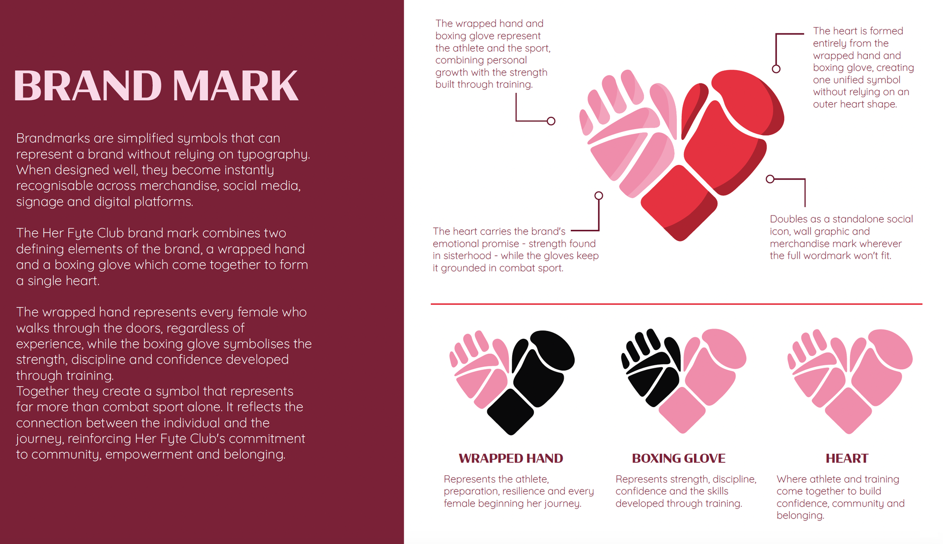
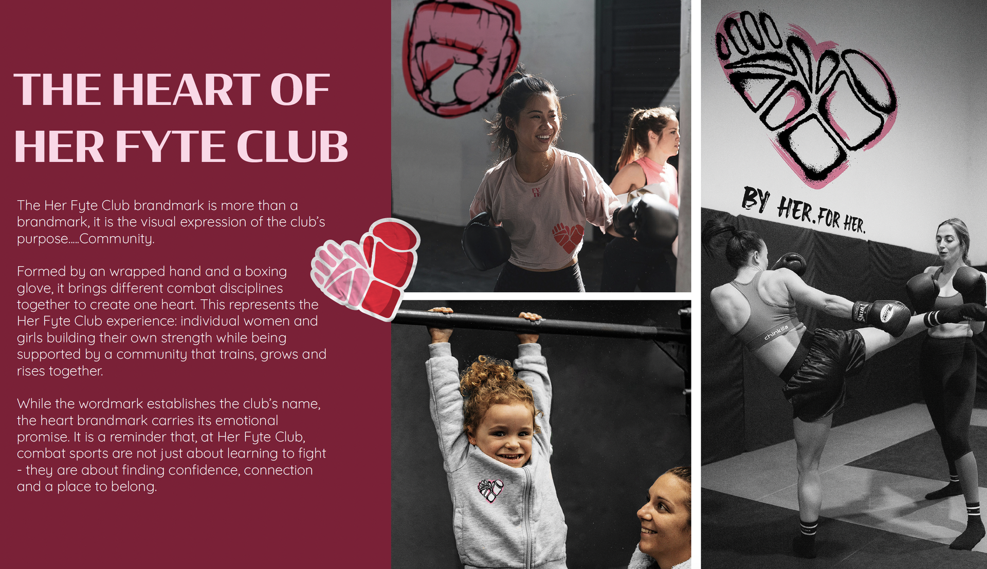
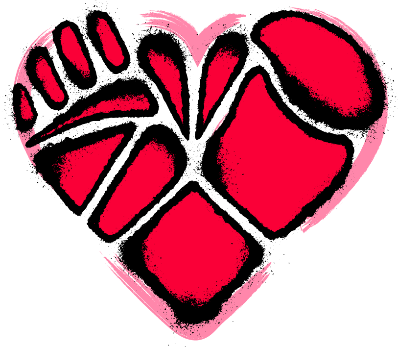
At the centre of the identity is the Her Fyte Club brandmark: a heart created from a boxing glove and wrapped hand, brought together to form one recognisable symbol.
The mark connects the physical reality of training with the emotional heart of the brand — strength, belonging and the community created inside HFC.
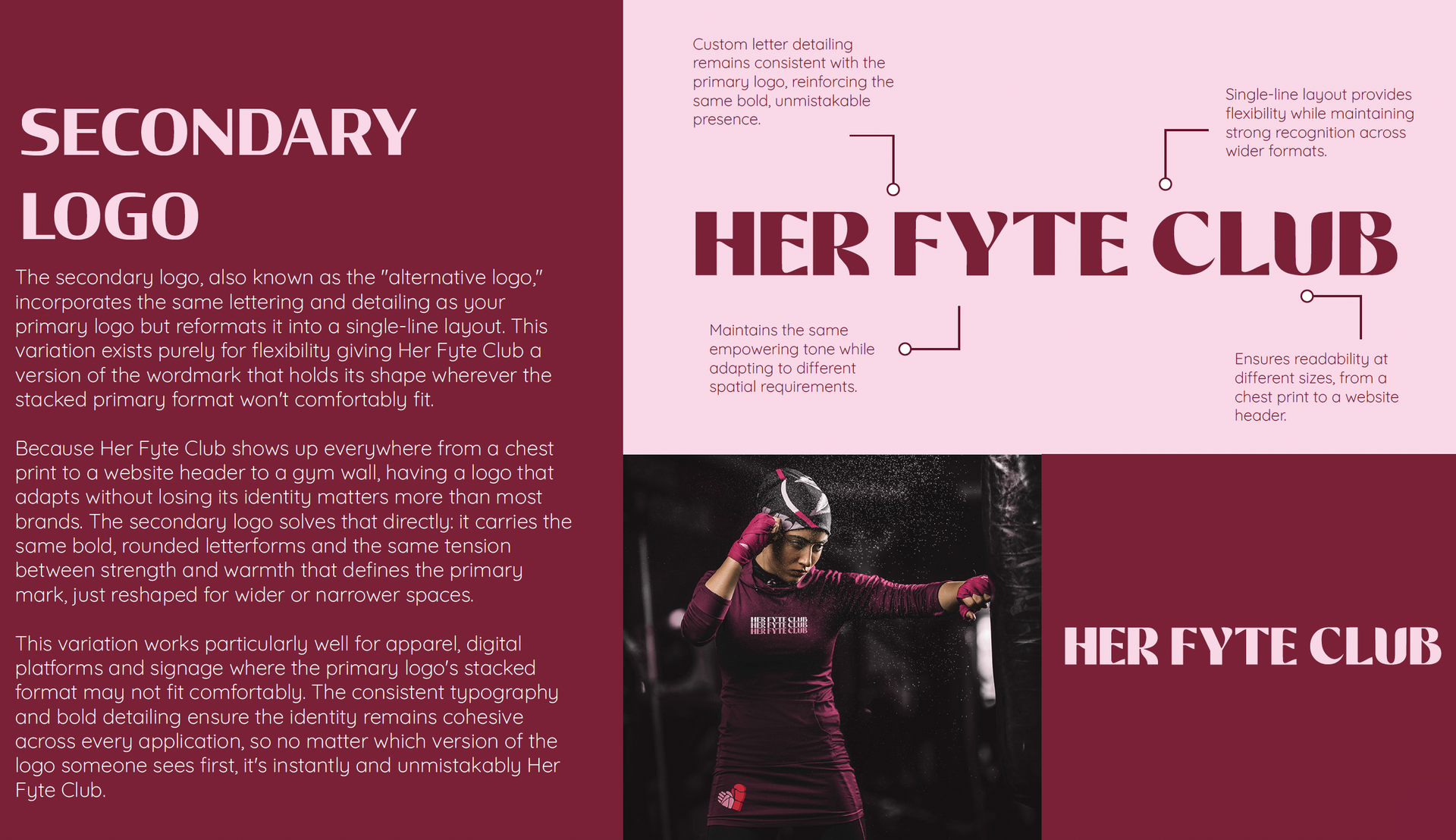
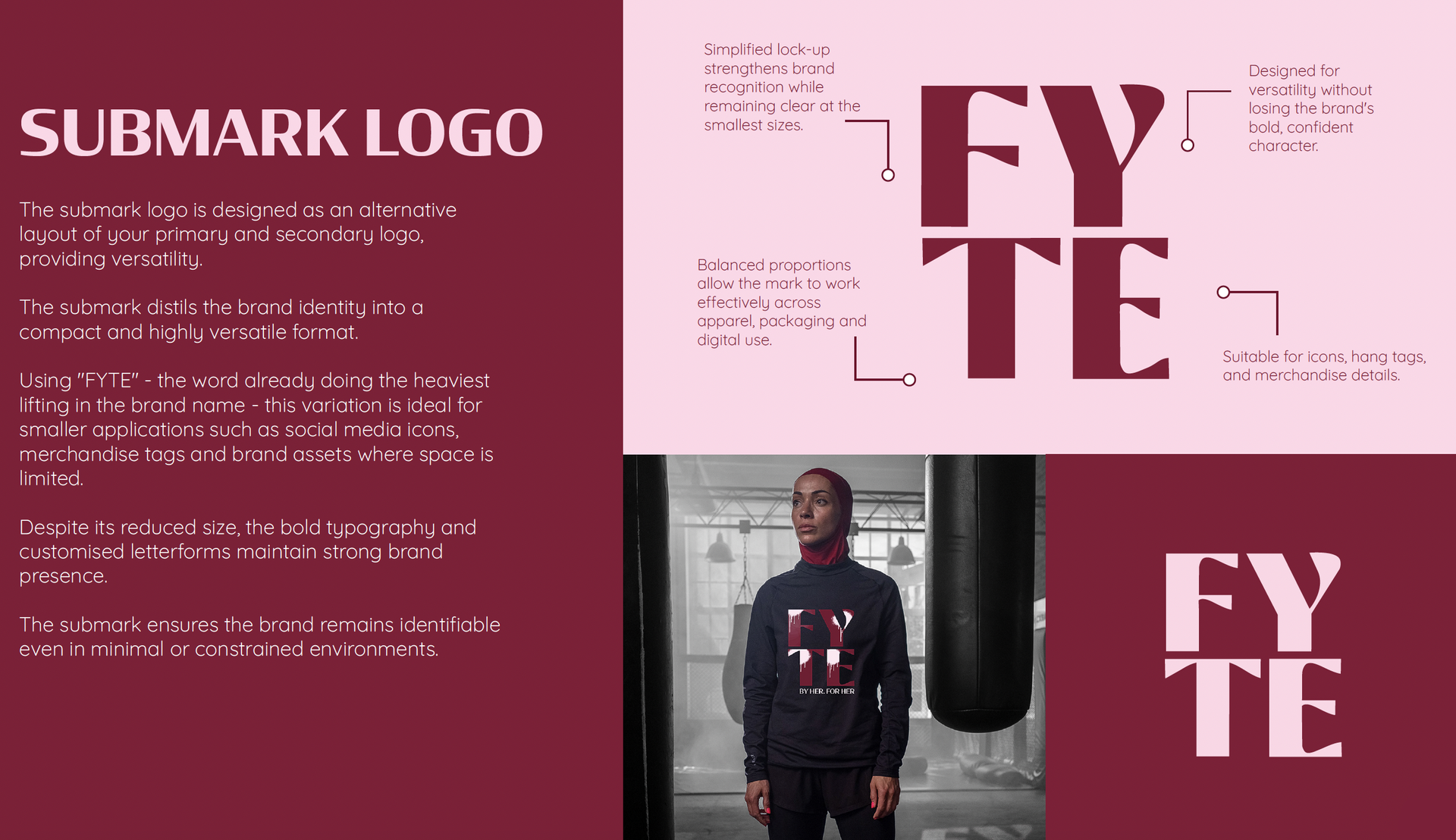
Designed to work independently from the wordmark, the brandmark gives Her Fyte Club a flexible visual shorthand that can live across apparel, social content, equipment, environmental graphics and future brand applications.
TYPOGRAPHY + COLOUR
BOLD BY DESIGN
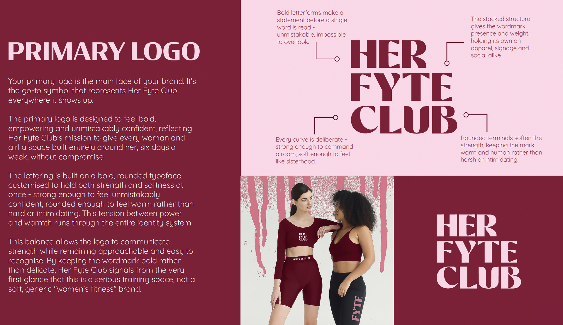
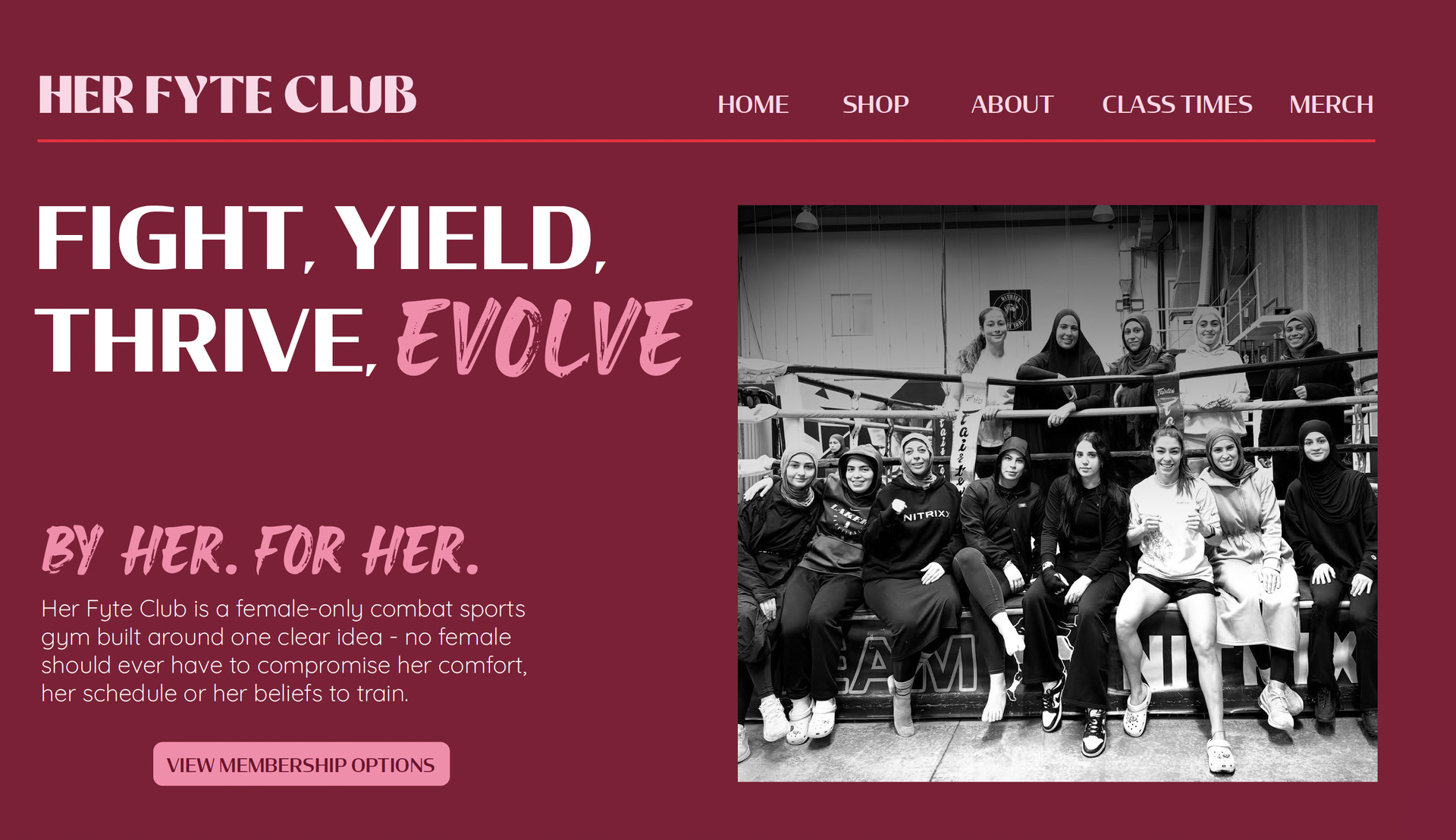
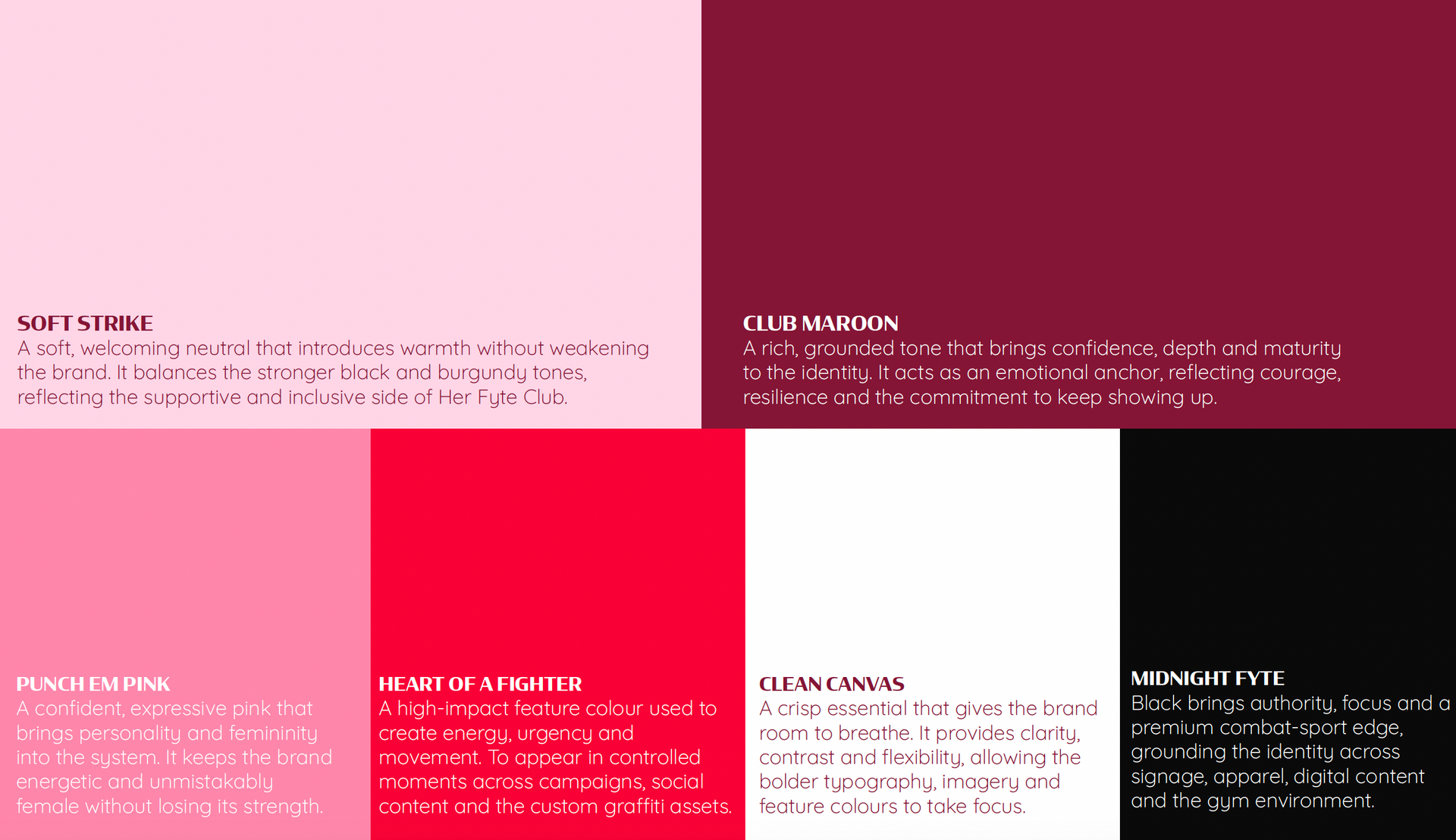
The typography and colour system were developed to give Her Fyte Club a recognisable visual presence across both digital and physical environments. Strong display typography creates impact and confidence, while the supporting type system keeps longer-form communication approachable and readable.
The colour palette combines deep maroon, punch pink, soft pink, black and white — giving the brand enough contrast to feel powerful while retaining a distinctly feminine edge.
BUILDING THE VISUAL LANGUAGE
MORE THAN A LOGO
A strong visual identity needs more than a logo to become recognisable.
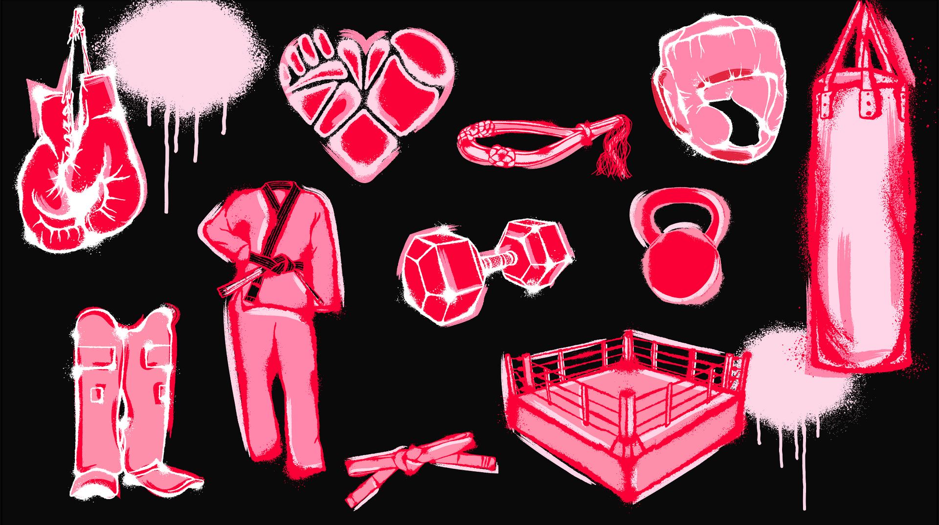
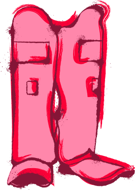
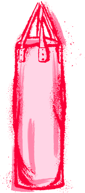
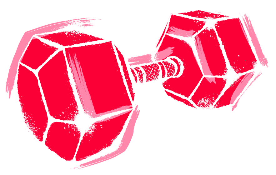
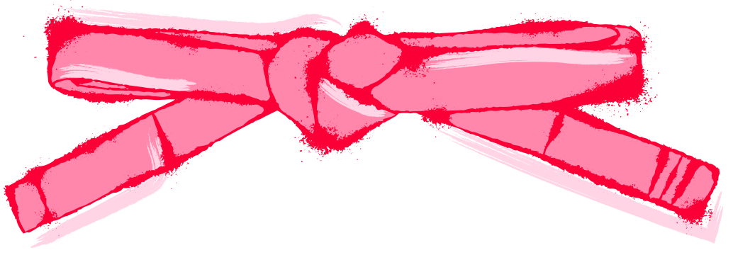
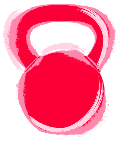
To give Her Fyte Club a distinctive graphic language, the identity was extended through a collection of hand-drawn, graffiti-inspired visual assets drawn from the training environment and the personality of the brand.
Gloves, equipment, movement and expressive graphic forms became flexible visual elements that could be mixed, layered and adapted across different applications.
The result is a system that can be playful when it needs to be, bold when it needs to be and unmistakably HFC throughout.






FROM IDENTITY TO SYSTEM
BUILT FOR REAL LIFE
The identity was designed to be practical as well as distinctive.
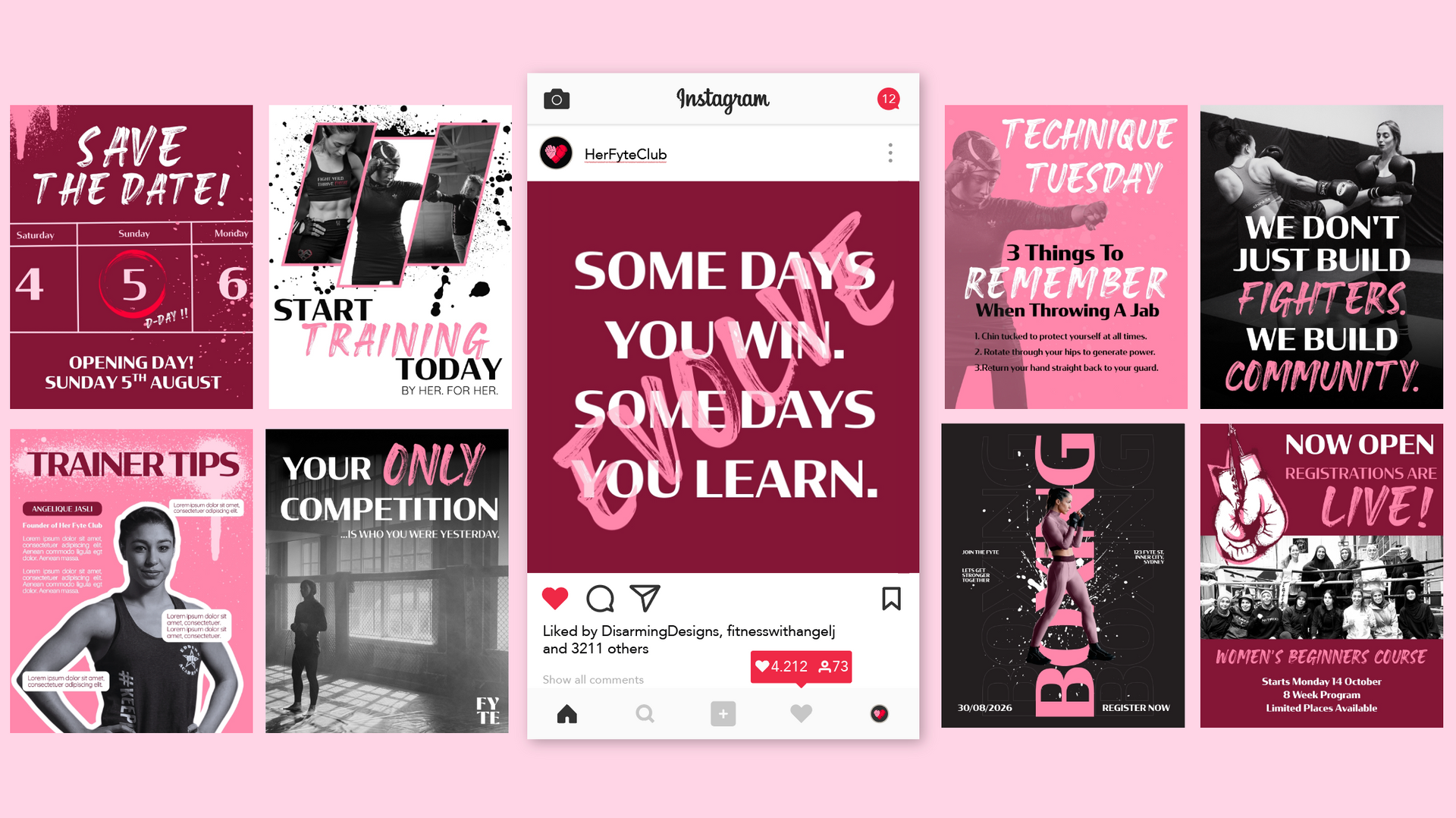
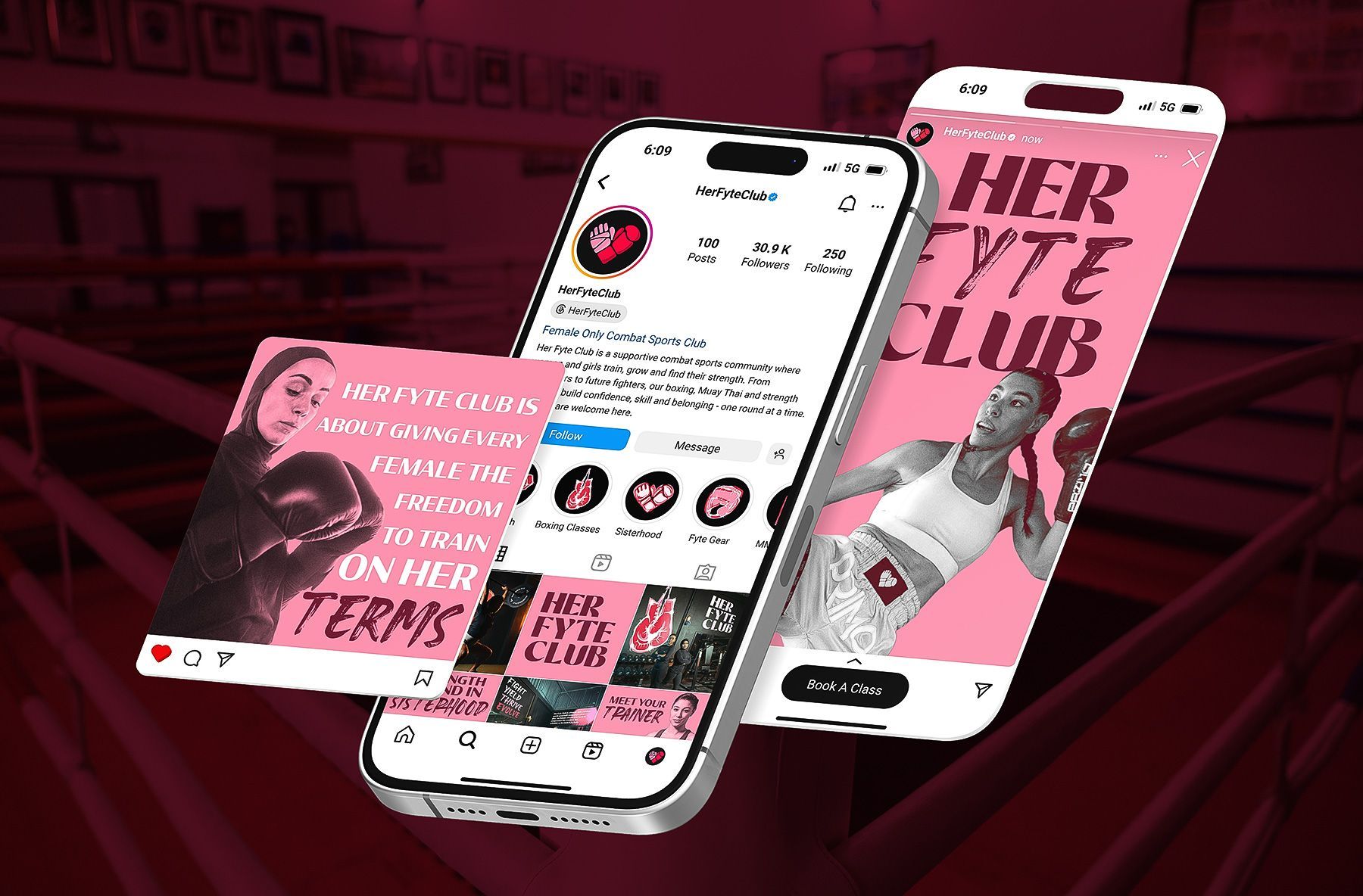
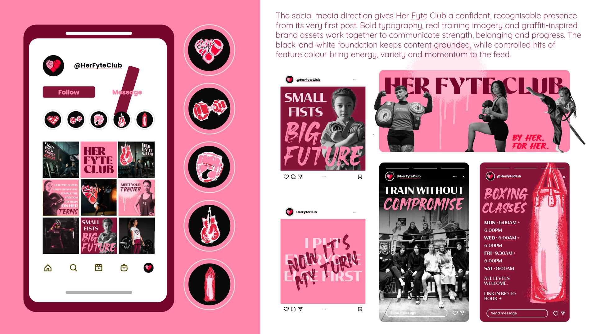
Rather than leaving Her Fyte Club with a set of static brand assets, the system was developed into comprehensive brand guidelines and reusable digital templates that allow the team to communicate consistently without needing to reinvent the brand every time.
Reusable Canva Templates were developed across educational content, coaching advice, FAQs, promotional content, events, mindset, community stories and member features, all built to feel like part of the same brand rather than disconnected social posts.
This turns the identity into something the team can actively use, adapt and grow with.
MARKETING + SPONSORSHIP COLLATERAL
DESIGNED TO BE PRINTED
The identity also needed to work beyond social media, It needed to work in print too.
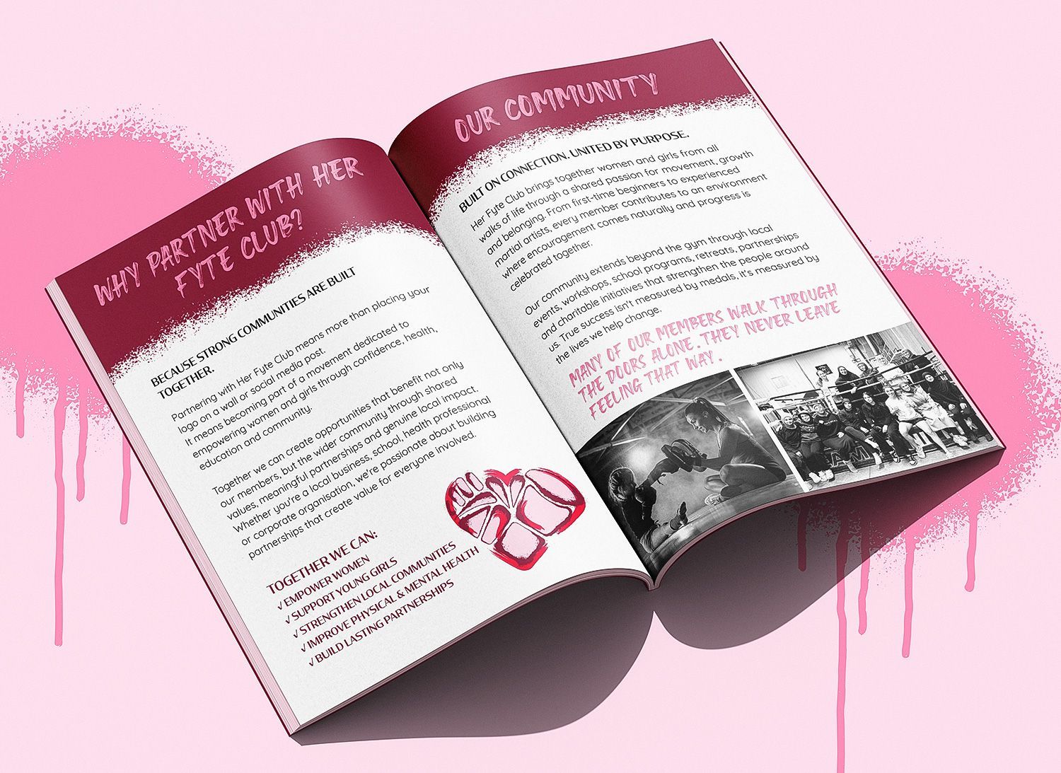
A suite of supporting marketing and community collateral was developed to help Her Fyte Club communicate with prospective members, its wider community and potential partners.
This included promotional flyers, newsletters, campaign materials and a comprehensive sponsorship proposal designed to help HFC approach potential sponsors with a professional, cohesive brand presentation.
The same visual language carries across each touchpoint creating consistency whether someone encounters HFC through Instagram, an email, a printed flyer or a sponsorship conversation.
THE BRAND IN MOTION
APPAREL DESIGNED FOR THE COMMUNITY
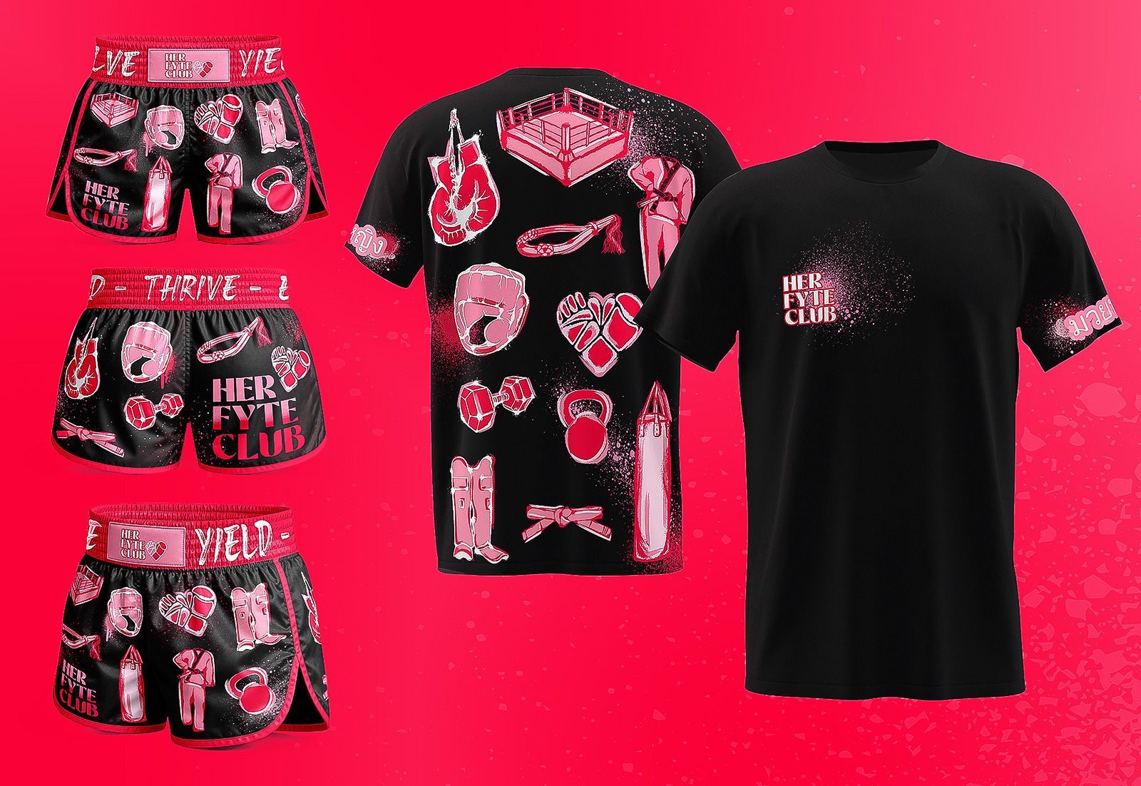
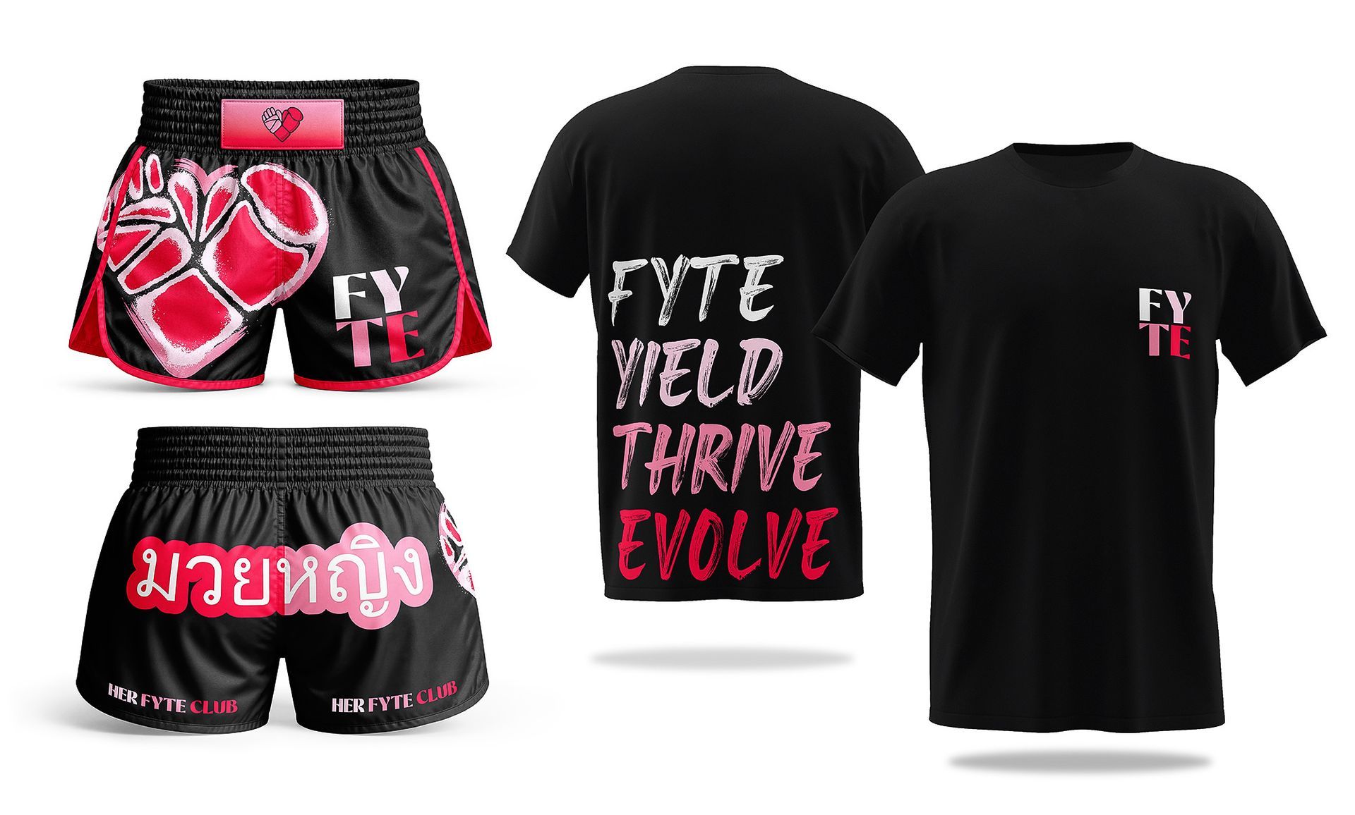
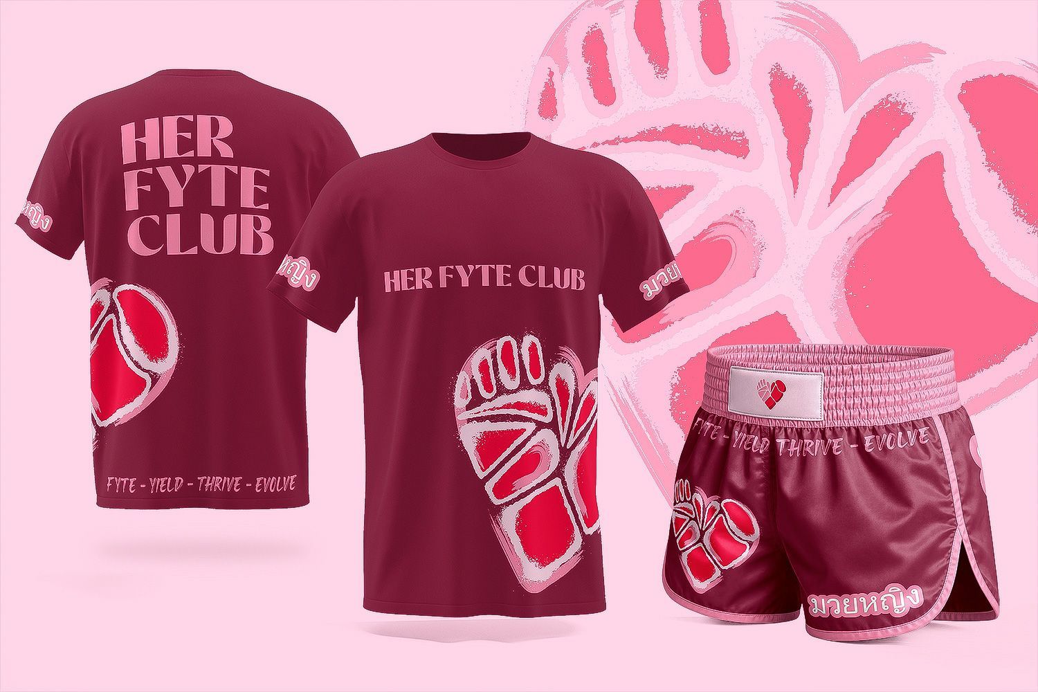
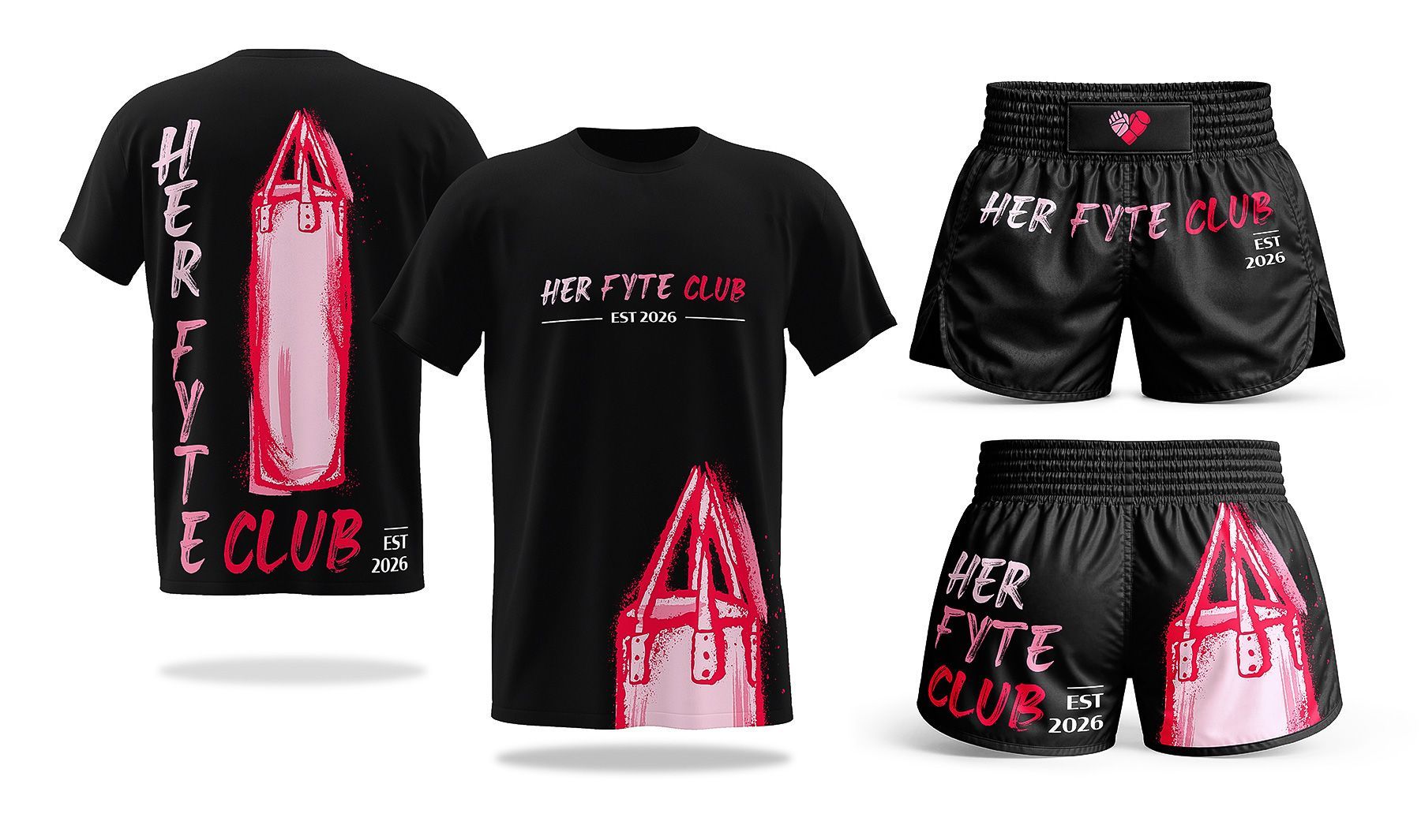
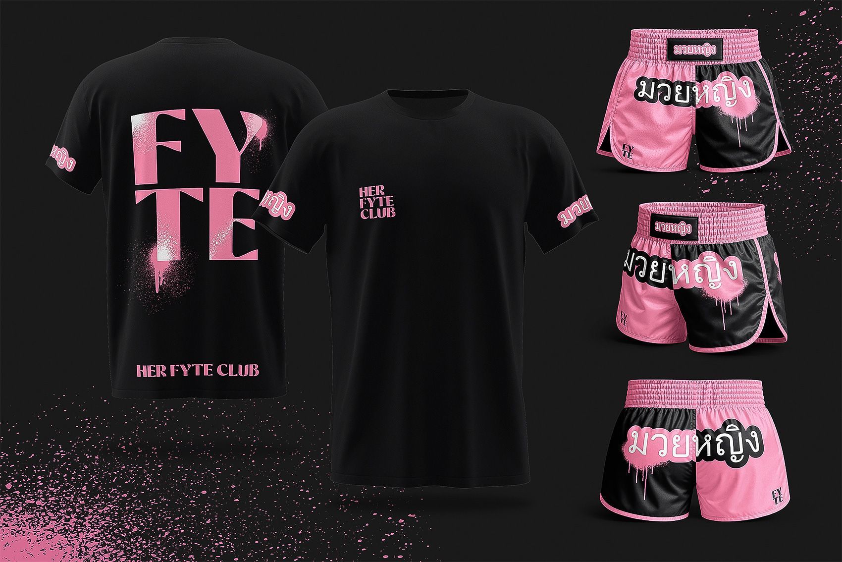
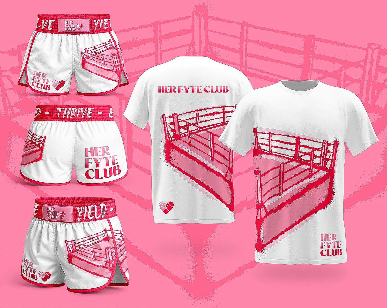
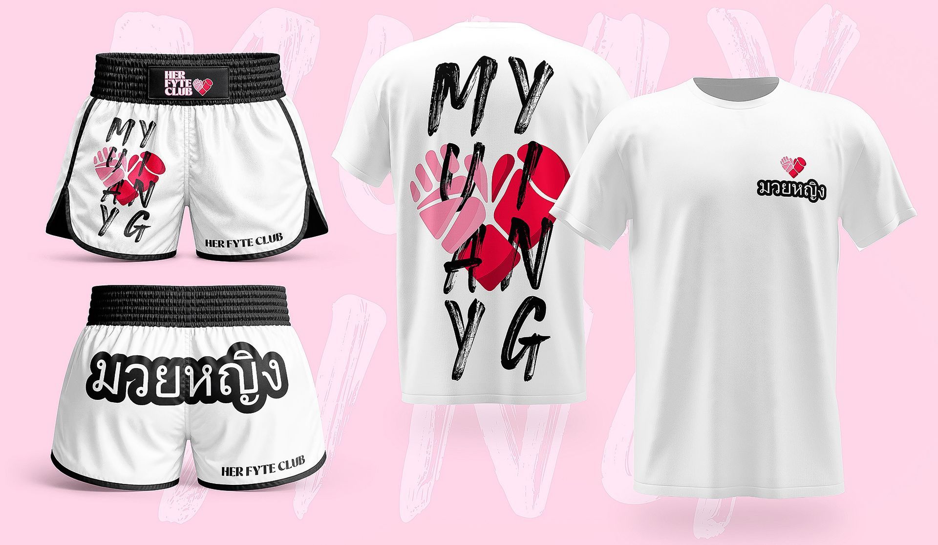
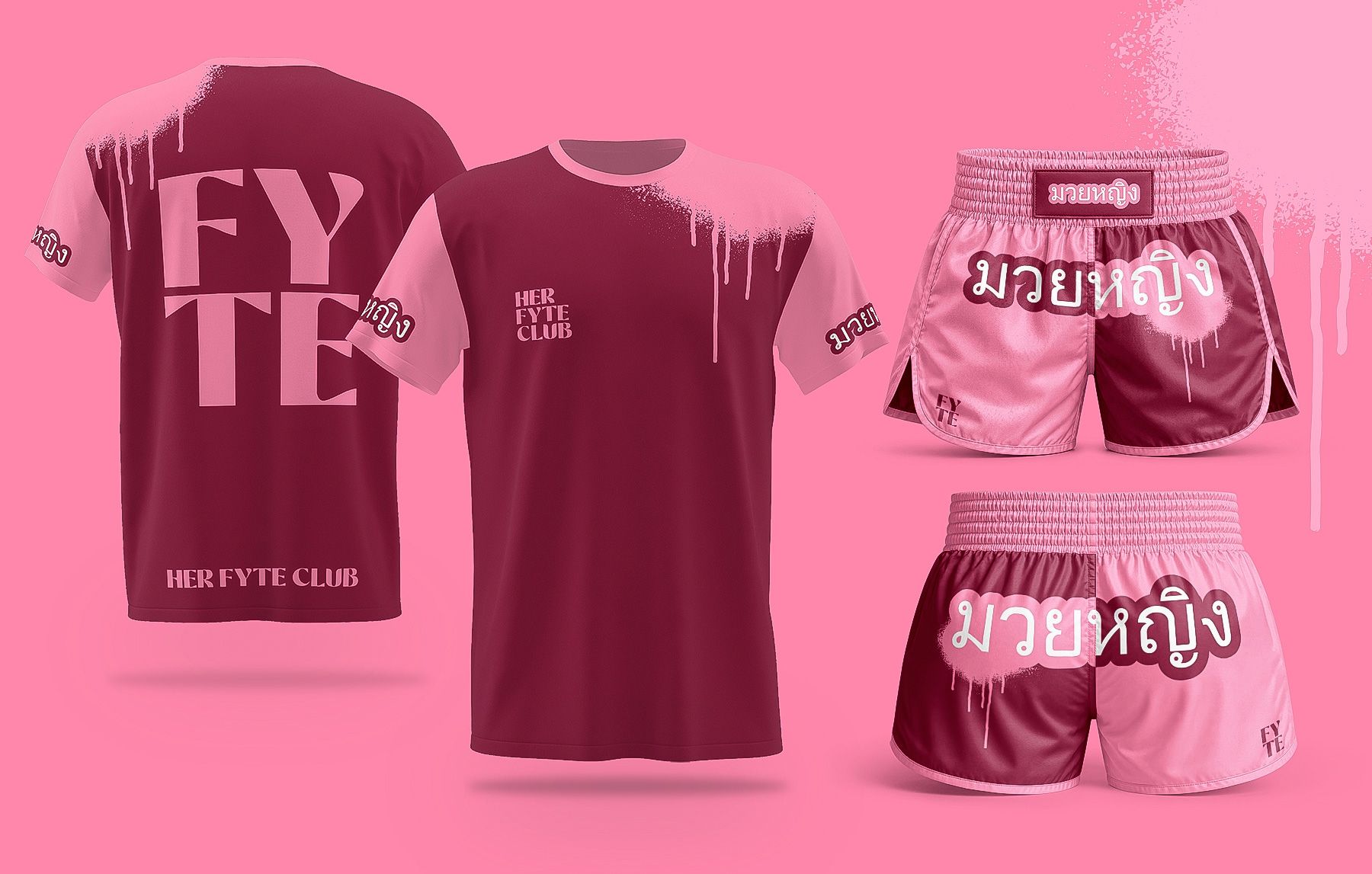
The identity was extended into apparel designed specifically for the HFC training environment.
Muay Thai shorts and training tops combine the existing HFC graphic language with sport-specific applications, creating apparel that feels connected to the wider brand rather than simply placing a logo onto generic sportswear.
The apparel system also incorporates the มวยหญิง / Muay Ying graphic developed specifically for Her Fyte Club, giving the collection an additional connection to the club's combat-sport offering while retaining the broader HFC visual identity.
THE RESULT
A BRAND BUILT TO GROW
Her Fyte Club now has more than a visual identity.
It has a strategic brand system built around the way the business actually operates. From the gym floor and training environment through to social media, community communications, apparel, marketing and sponsorship, all brought together in a comprehensive brand guidelines document.
The final identity gives HFC a distinctive presence in the women's fitness space while creating enough flexibility to evolve as the club, its community and its ambitions grow.
Most importantly, the brand now has the visual confidence to communicate what Her Fyte Club has always been about:
strength, confidence, community and belonging.

Ready to get your business branded?
THE DISARMING DOWNLOAD