
HER FYTE CLUB
Brand Strategy
Full Visual Identity Design
Logo Suite (Primary, Secondary, Submark + Brandmark)
Custom Illustrated Asset System
Social Media Templates + Highlight Covers
Apparel & Merchandise Design
about this project
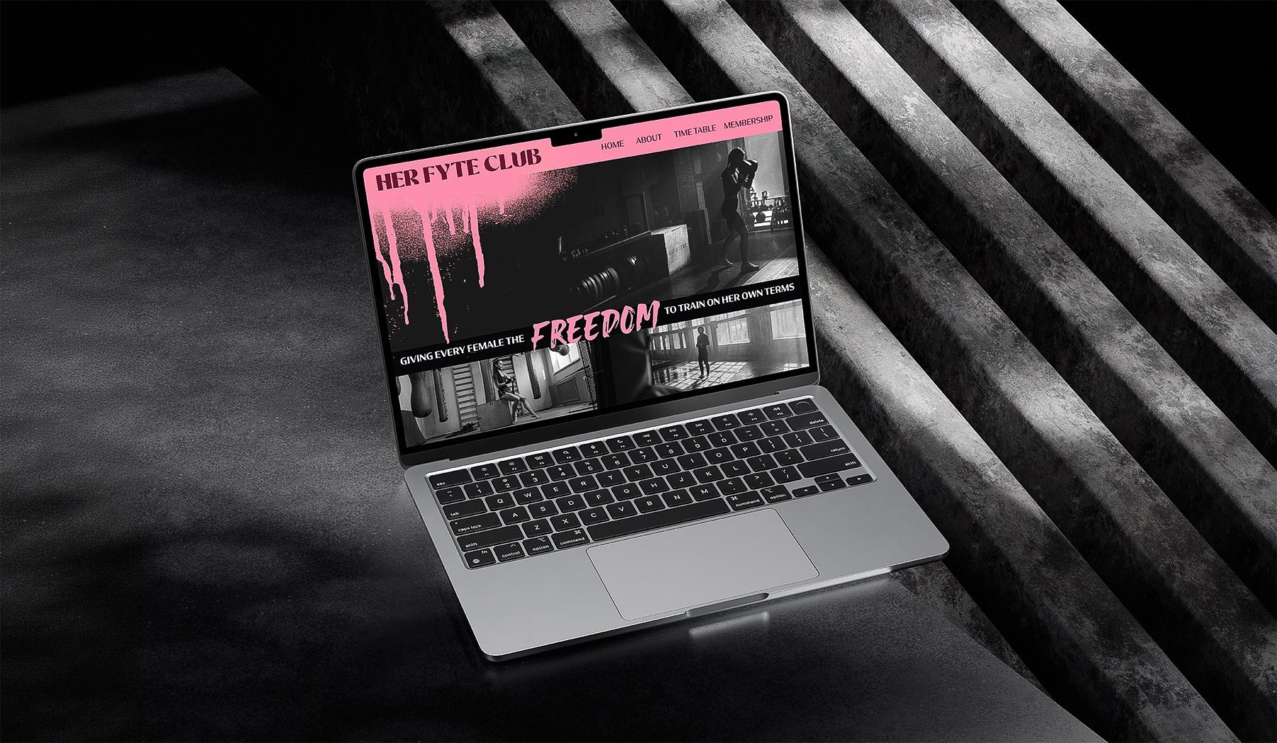
Her Fyte Club walked in wanting to be the brand that finally looked and sounded as bold as the women training inside it - not another pink-washed "women's fitness" brand doing the same thing as everyone else in a category that's gone visually flat. So that's exactly what I built.
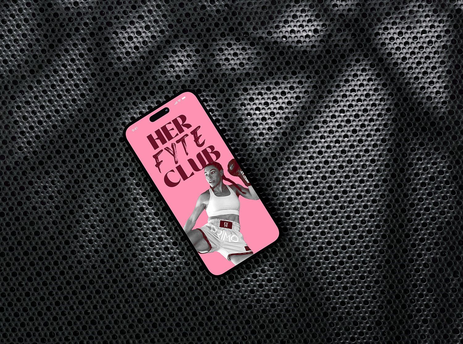
The brand mark, a heart formed entirely from a wrapped hand and a boxing glove, refined against real client feedback until every detail earned its place. Backed by a full brand strategy, a bold maroon-and-pink identity and a custom illustrated asset system, the result is a female-only combat sports gym that's impossible to mistake for anyone else in the category.
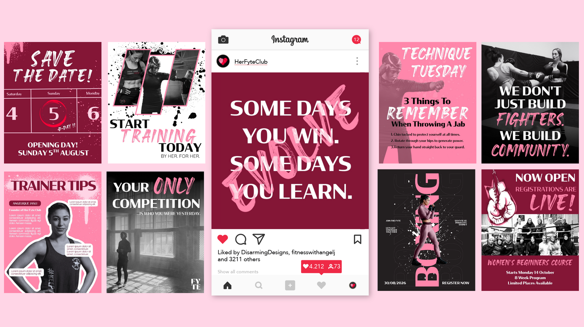

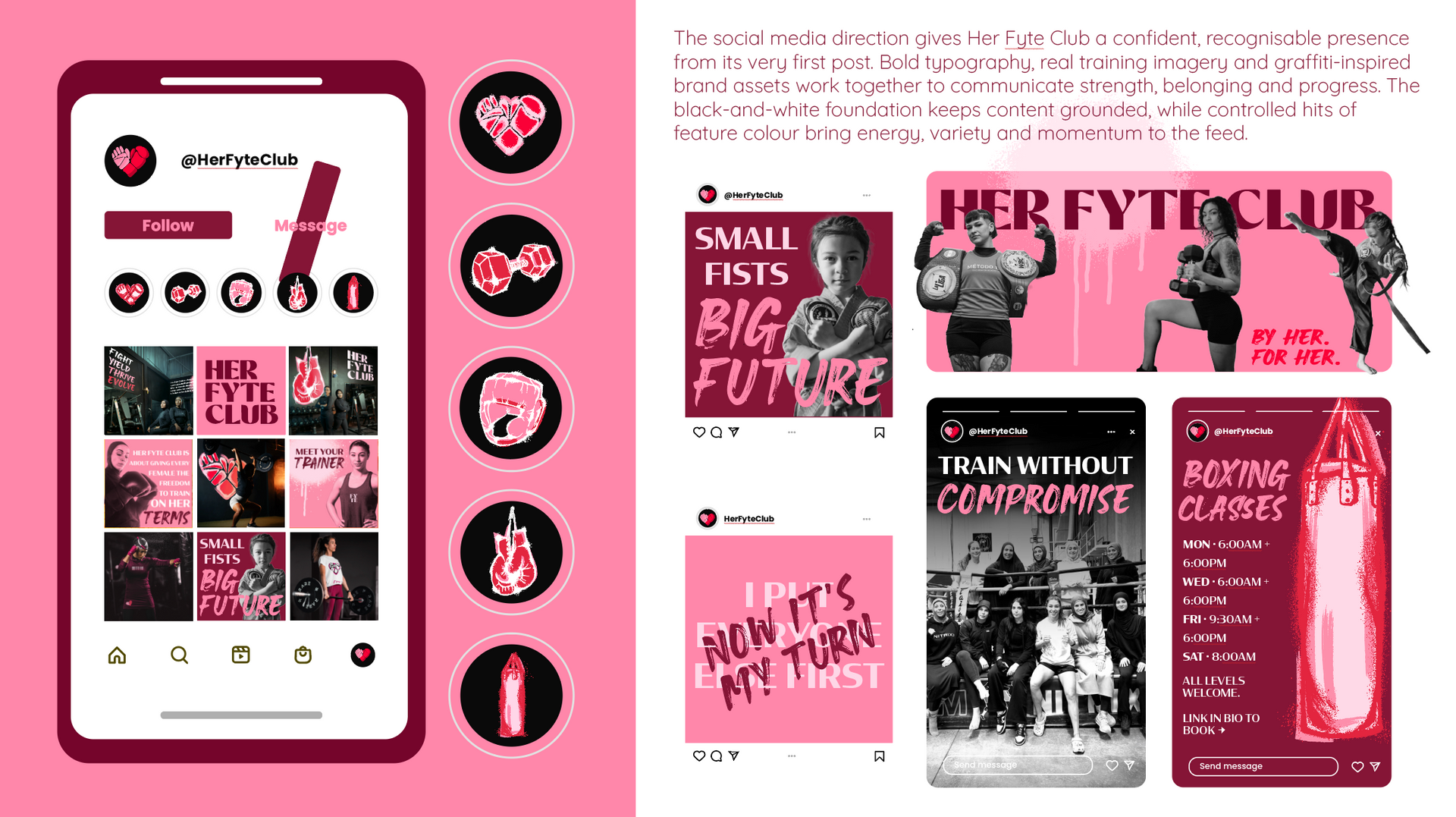
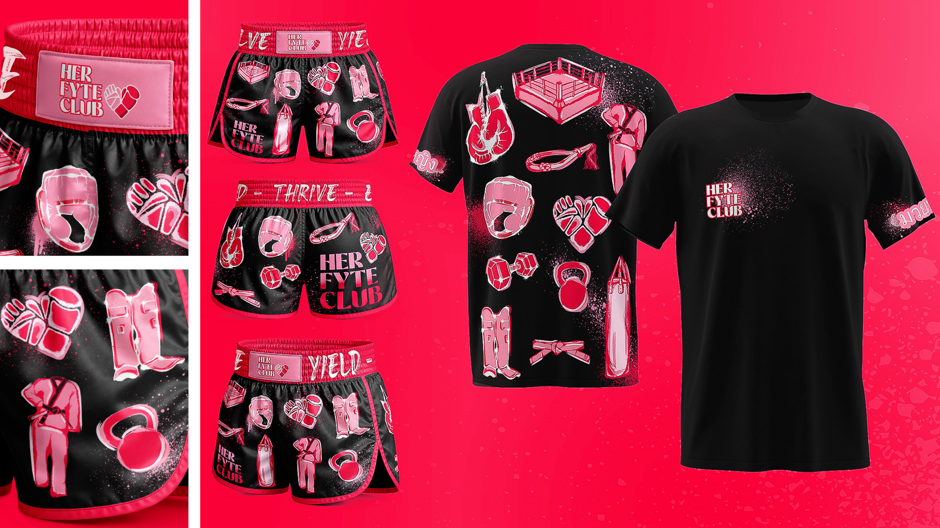

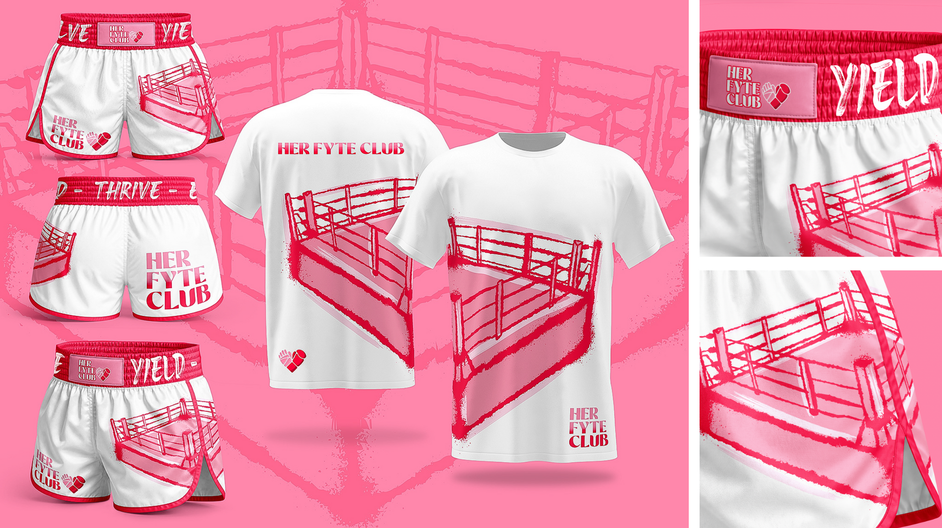
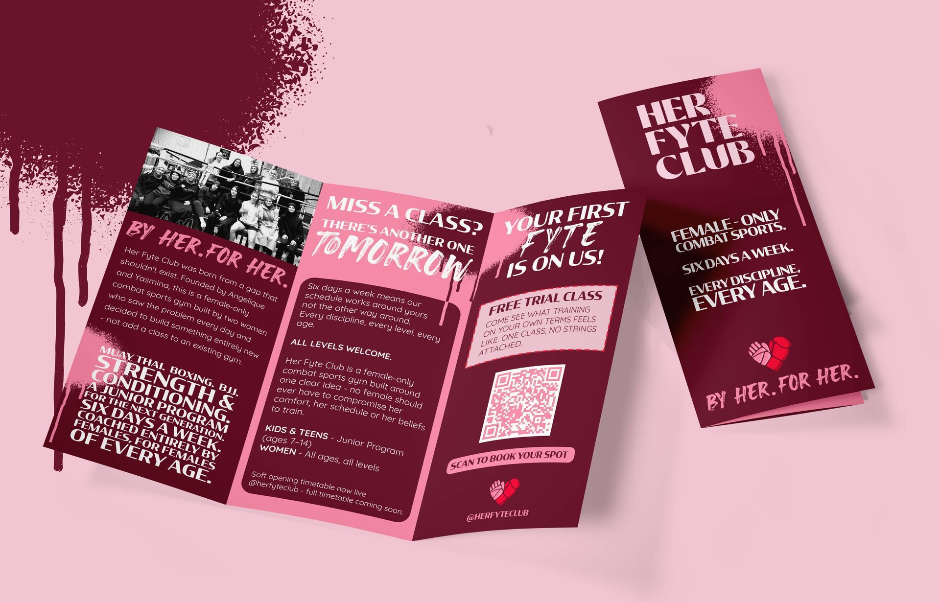
Strategy First - Before a single visual decision got made, the strategy came first — five core values, four audience personas and a brand voice built to speak to every female who walks through the door, from a nervous first-timer to busy working mum and from a 5 year old looking to build confidence to competitive amateur fighter.
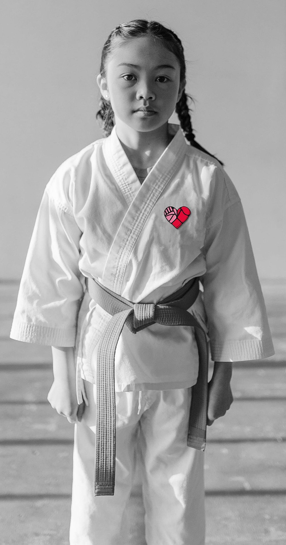
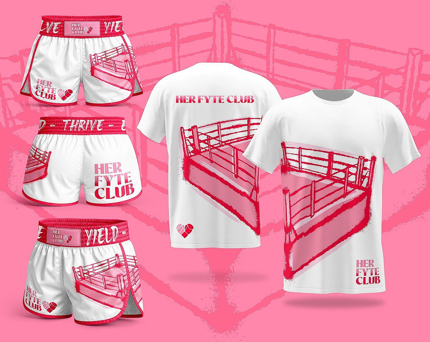

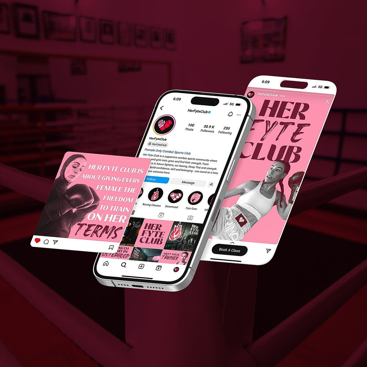


Bold, grounded, and impossible to ignore, a visual identity that smashes the tired tropes of the wellness world + delivers something with real attitude. Raw, rebellious + one of a kind.
Want a full breakdown of this Brand and how I created each element? Click the Button Below!
New Paragraph